0
Posts By :

Good Optics Design Co

10K logo
Abstract Logos: An Artistic Approach to Brand Identity
Abstract Logos: An Artistic Approach to Brand Identity 1024 640 Good Optics Logo & Branding Design

Abstract logos have become a popular choice for companies looking to create a unique and visually captivating identity. These logos use shapes, colors, and forms that don’t directly represent objects, but instead aim to evoke feelings or ideas that align with a brand’s message.

Abstract logos are perfect for businesses that want to stand out and make a bold statement without relying on literal imagery.

What Are Abstract Logos?

Verstovia logo

Unlike logos that feature real-life objects, like animals or buildings, abstract logos are non-representational. These logos typically consist of shapes, lines, or colors that don’t immediately convey a specific object or subject, but instead represent an idea or concept. The goal is to create a visual symbol that feels dynamic and memorable, often leaving room for interpretation.

10K logo

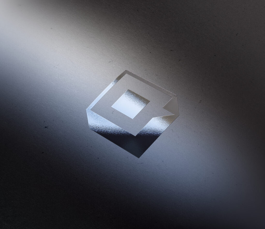
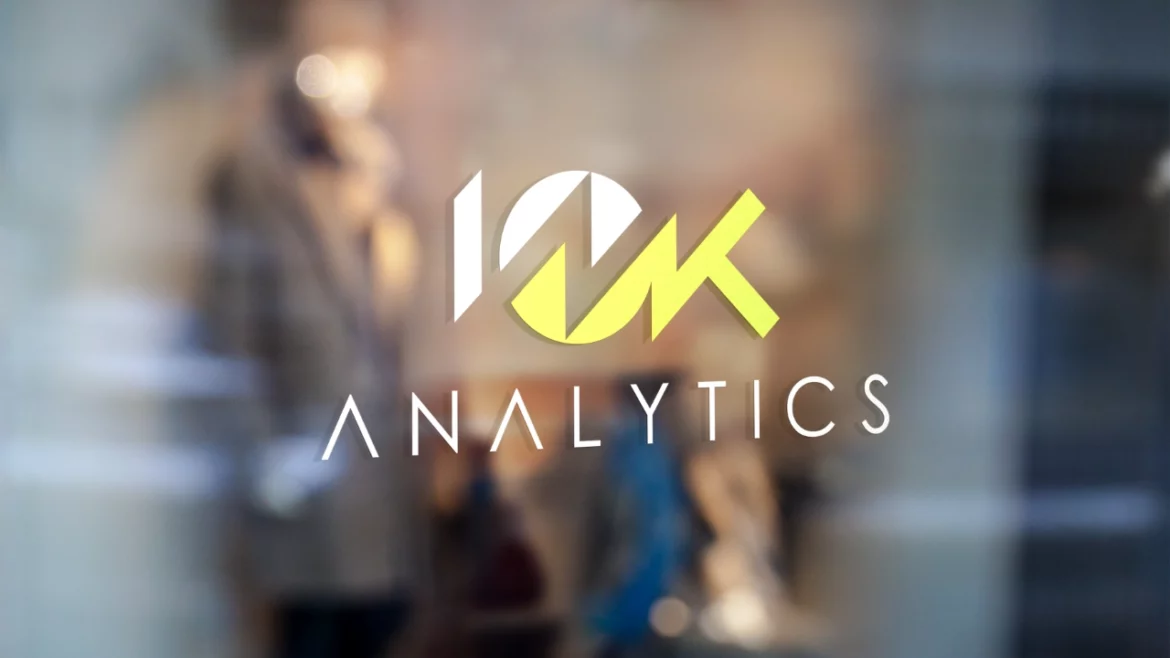
For example, the 10K Analytics logo uses a combination of sharp, geometric shapes and contrasting colors. The abstract design reflects the brand’s focus on technology and analytics, creating a modern, tech-savvy image without directly showing data or charts, but instead suggesting them in the form of an abstract line chart.

Why Choose Abstract Logos?

One of the main reasons businesses opt for abstract logos is their ability to create a distinct identity without being tied to a literal or descriptive image. Abstract logos offer a level of flexibility and creativity that other styles may not provide. They allow businesses to communicate core values and evoke specific emotions through colors, forms, and arrangements.

Baroque Villas logo

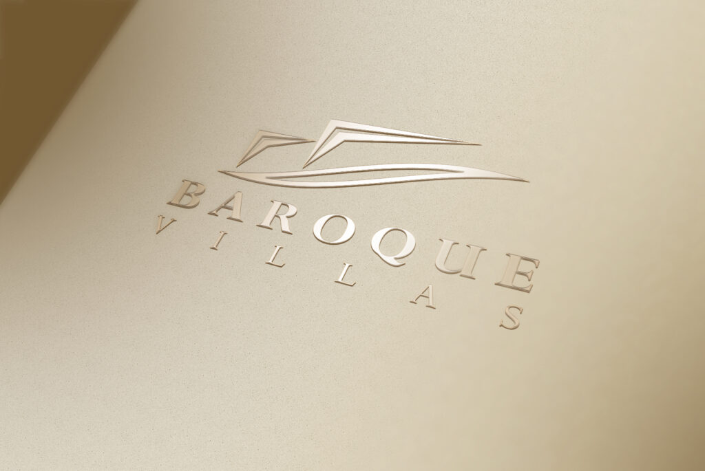
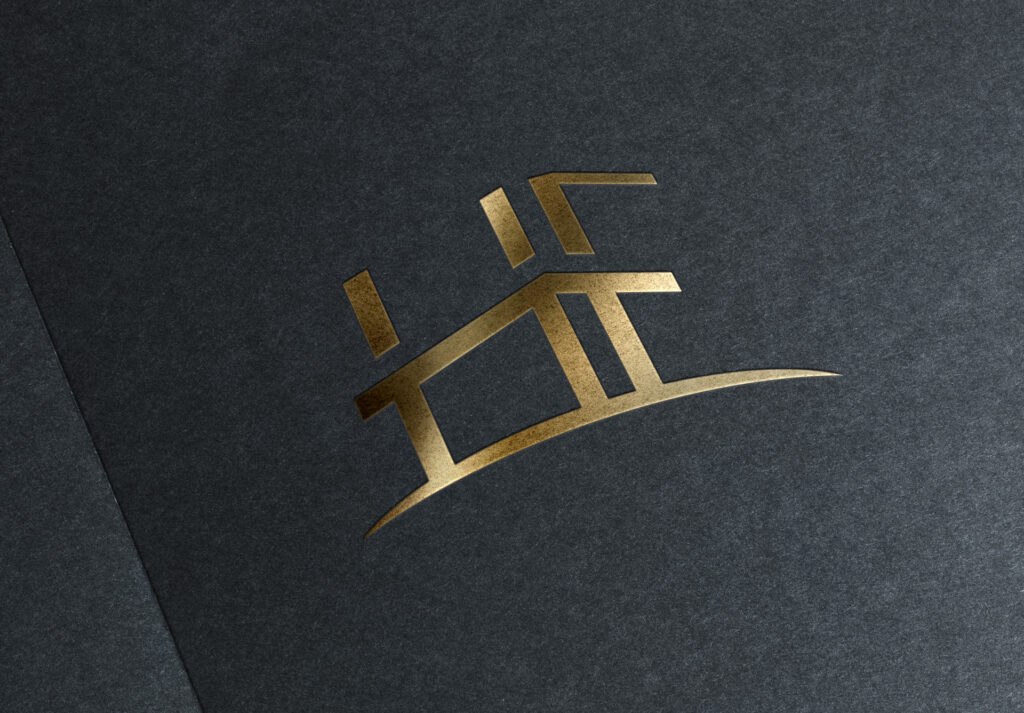
For instance, the Baroque Villas logo features sleek, flowing lines that are reminiscent of luxury and elegance. It doesn’t depict a specific villa or mansion, but rather uses abstract shapes to conceptualize it. This approach allows the logo to stand out in a competitive market while remaining timeless and adaptable.

Abstract Logos for Different Industries

Abstract logos are incredibly versatile and can be used across a wide variety of industries. Whether you’re in tech, real estate, fitness, or even finance, an abstract logo can help set your brand apart.

First & Marion logo

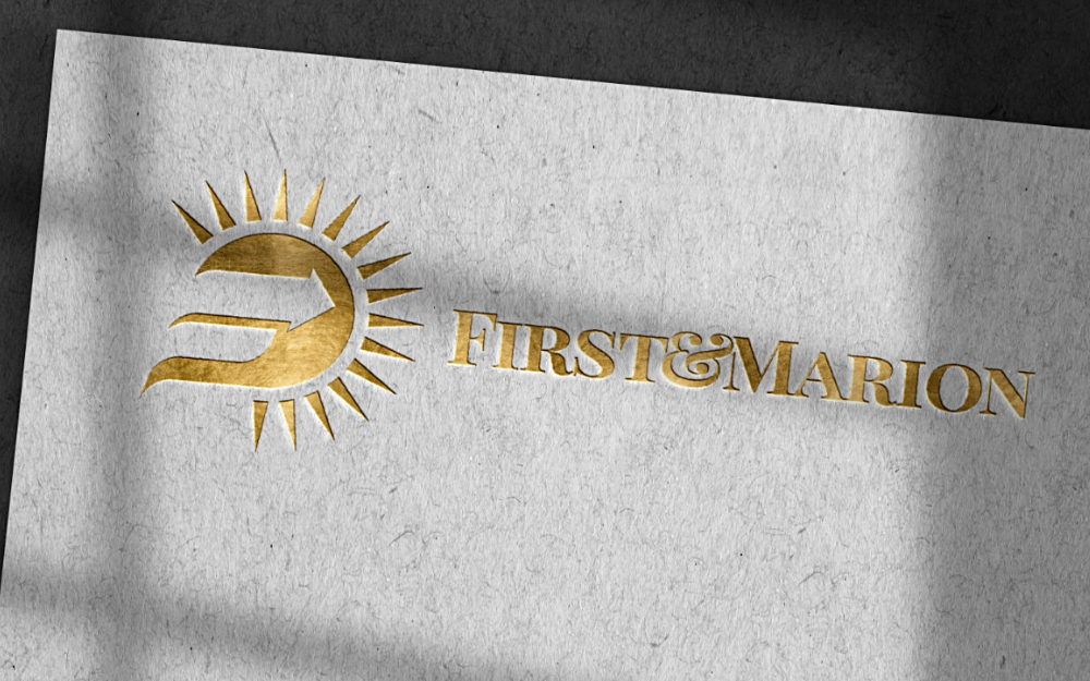
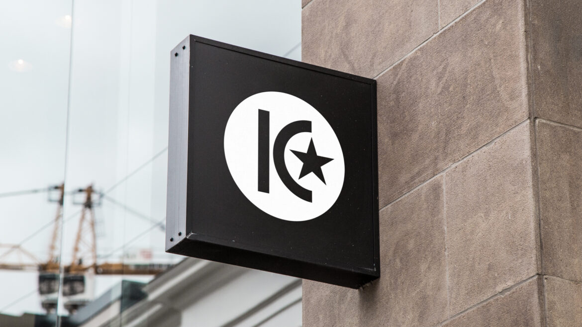
The above logo is a great example of how abstract logos work in the financial services sector. The sunburst shape combined with a forward-facing arrow creates a sense of optimism, growth, and direction, and it also represents the letter “F” in an abstract style. This represents the brand’s goal to lead clients toward financial success, without relying on the overused imagery of dollar signs or financial graphs.

MC Logo

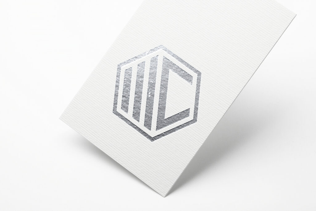
For personal trainers or health-related businesses, abstract logos can help convey energy and motion, like the MC personal trainer logo depicted above. The dynamic design, using bold lines and geometric forms, embodies the strength associated with fitness, while keeping the focus on the business’s active and motivational values.

Benefits of Using Abstract Logos

  • Timeless Design: Abstract logos tend to age well because they don’t rely on trends or specific imagery that may become outdated. Their simple, clean design ensures they remain relevant for years.
  • Flexibility: An abstract logo can work across various mediums and applications, from websites to business cards to large billboards, without losing its impact.
  • Brand Recognition: When executed well, abstract logos can be incredibly effective at creating brand recognition. Their unique and often striking nature makes them easy for customers to remember.
  • Evokes Emotion: Abstract logos can communicate emotions, values, and core brand messages through their shapes and colors, making them more engaging than traditional logos.

Final Thoughts

Abstract logos are an excellent choice for businesses that want to create a bold, unique, and adaptable brand identity. With their non-literal design, these logos can communicate your brand’s personality and core values in a visually compelling way. Whether you’re in the tech industry, real estate, fitness, or any other field, an abstract logo can help set your business apart and leave a lasting impression on your audience.

If you’re looking for a professional, modern, and visually striking abstract logo, Good Optics Design Co can help. We specialize in creating custom logos that reflect your brand’s values and vision. Contact us today to get started on your abstract logo design and elevate your branding to the next level!

Rising Dragon
Mascot Logos: A Fun and Engaging Way to Build Brand Identity
Mascot Logos: A Fun and Engaging Way to Build Brand Identity 1024 640 Good Optics Logo & Branding Design

When you’re looking to make your brand stand out and engage with your audience in a fun, memorable way, mascot logos are an excellent option. These logos feature a character or mascot that represents the essence of your business, often with a playful, animated, or humanized design.

Mascot logos are great for creating an approachable and personable brand image that customers can easily connect with.

What Are Mascot Logos?

Mascot logos typically feature a character that is either an animal, person, or fantasy creature that embodies the qualities of the brand. They often add personality, charm, and even humor to a business, making them easily identifiable and approachable. These logos are especially effective for companies that want to convey friendliness, energy, or fun.

Mascot Logo

One great example from our portfolio is the Final Boss logo, which features a pixelated monster character. This mascot gives the brand an instant retro, fun vibe and connects with gaming culture, making it ideal for a brand in the gaming or tech industry.

Why Choose Mascot Logos?

Mascot logos help create a personal connection between your business and its audience. They make your brand feel more human and accessible, which can be especially helpful in industries like food, entertainment, or children’s products. Mascot logos can be used on a variety of marketing materials, from packaging to advertisements, and they often appear in a variety of settings—whether animated in videos or printed on merchandise.

Vending Logo

For instance, Nola Vending uses a mascot logo with an illustrated girl giving a thumbs-up, creating an instantly positive and friendly vibe. This logo is warm, inviting, and perfectly reflects the playful nature of a vending business, making it more relatable to customers.

Mascot Logos for Different Industries

Mascot logos are versatile and work well in a range of industries. From sports teams to retail businesses to pet care companies, a mascot logo can be designed to reflect the personality of any business.

Rising Dragon

The Rising Dragon logo, for example, is a fierce dragon mascot that conveys power and determination. The sharp design and bold color choices create a dynamic and energetic feel, which works perfectly for an esports team or an action-oriented brand.

Dog Grooming Logo

On the other hand, a more lighthearted approach is seen in the Wiggle The Waggles logo. This cute, friendly dog character captures the playful and loving nature of a pet care or pet-related business. Mascot logos like these help to establish trust and an emotional connection with customers, making them more likely to engage with your brand.

Benefits of Mascot Logos

  • Increased Brand Recognition: Mascots make your brand more memorable. When customers see a recognizable character associated with your business, it’s easier for them to recall your brand in the future.
  • Personality and Fun: Mascot logos add a fun, relatable personality to your brand, which can differentiate you from competitors. A well-designed mascot helps customers see the human side of your business.
  • Emotional Connection: A mascot can represent qualities or values that your target audience relates to. Whether it’s strength, playfulness, or creativity, a mascot can build an emotional bond with your audience.
  • Versatility: Mascot logos are highly adaptable. They can be used in different contexts, from social media profiles to advertisements to merchandise. Plus, they can evolve over time with different outfits, expressions, or settings, keeping your brand fresh.

Final Thoughts

Mascot logos are an incredible way to build a unique and engaging brand identity that sticks with your audience. Whether you’re aiming for playful, fierce, or relatable, a well-designed mascot can convey your brand’s message while building an emotional connection with customers.

At Good Optics Design Co, we specialize in crafting custom mascot logos that capture the spirit of your brand. If you’re ready to bring your brand to life with a mascot logo, reach out to us today for all your logo design and branding needs. Let’s create something memorable together!

Emblem logo design
Emblem Logos: A Classic Choice for Strong Brand Identity
Emblem Logos: A Classic Choice for Strong Brand Identity 1000 625 Good Optics Logo & Branding Design

When it comes to crafting a memorable brand identity, emblem logos have always been a powerful choice. These logos feature a combination of symbols, text, and sometimes even a border, creating a unified and cohesive design that conveys your brand’s story at a glance. Whether you’re running a brewery, an outdoor company, or a circus, an emblem logo can encapsulate your brand’s essence in one striking visual.

What are Emblem Logos?

Emblem logos are typically round or shield-like shapes with a combination of text and symbols. They often have a vintage, official feel to them, making them ideal for brands looking to communicate tradition, reliability, and professionalism. The design structure allows for easy recognition and a sense of authority, making it a popular choice for various industries.

For example, consider the Seattle Brewing Company logo. This emblem logo features the city’s skyline, a beer bottle cap, and bold text, giving it an instantly recognizable vibe that ties the brand to the local community. It’s a classic example of how emblem logos can merge iconic imagery with business name text for a seamless look.

Emblem Logo Design Tutorial

Watch our step-by-step tutorial for learning how to create an emblem logo design with a vintage flare using Adobe Illustrator:

Why Choose Emblem Logos?

There’s something timeless about emblem logos. Unlike simpler designs, emblem logos tend to be more intricate and detailed, making them memorable and full of personality. They also provide the versatility of being used across different mediums—whether on merchandise, business cards, or social media.

Emblem Logo

The Les Deux Alpes logo is another great example of an emblem logo that uses a combination of elements—mountains, skis, and the name itself—wrapped in a circle. It’s perfect for a skiing event that wants to showcase its adventurous spirit while maintaining a traditional, established feel.

Round Emblem

Not only do emblem logos stand out, but they also help create a cohesive brand identity. Brands can use their logo across packaging, signage, and more without worrying about losing visual impact. The Cirqster logo exemplifies this by combining playful elements like circus tents and stars in a circular design that feels fun and engaging, while also maintaining professionalism.

Emblem Logos for Different Industries

Southern Soul

Emblem logos are incredibly versatile, which is why they work well in a variety of industries. From outdoor brands like Southern Soul Outdoors to quirky businesses like the Rio Rojo restaurant logo, the possibilities are endless. Whether you want to emphasize adventure, food, or fun, an emblem logo can be tailored to reflect your business’s personality.

Rio Rojo logo

Take the Daily Pick Mushroom logo, for instance. This logo cleverly combines mushrooms and a ribbon banner, which makes it clear that the business is about fresh produce—specifically mushrooms. The emblem style is especially effective for food-related businesses, creating a memorable and inviting design that customers can easily recognize.

Daily Pick Mushroom

Benefits of Using Emblem Logos

  • Instant Recognition: Emblem logos are packed with visual elements that make them highly recognizable. When done well, these logos are memorable, making it easier for customers to identify your brand.
  • Timeless Appeal: Emblems have a classic design, which means they age well. Unlike trendy logos that can quickly look outdated, emblem logos retain their charm for years.
  • Versatility: Whether you’re printing them on a hat, a sign, or a website, emblem logos are adaptable. They maintain their integrity across different platforms and sizes.
  • Conveys Authority: Many emblem logos have a heraldic or official feel, which can help communicate trustworthiness and professionalism—qualities that are important for many brands.

Final Thoughts

If you’re looking for a logo design that combines tradition, creativity, and versatility, an emblem logo might be the perfect choice for your brand. Whether you’re in the brewing industry, the outdoors market, or a completely different sector, emblem logos have the power to elevate your brand identity and make a lasting impact on your audience.

At Good Optics Design Co, we specialize in crafting emblem logos that reflect the unique essence of your brand. From the first sketch to the final design, we work with you to create a logo that not only stands out but also tells your brand’s story in a visually compelling way. Contact us today to get started on your emblem design and branding journey!

Iconic brand mark logo
Iconic Brand Marks: The Key to Building a Memorable Brand
Iconic Brand Marks: The Key to Building a Memorable Brand 1024 768 Good Optics Logo & Branding Design

When you think of some of the biggest companies in the world, what’s the first thing that comes to mind? For most people, it’s their logo. Whether it’s the swoosh of Nike, the golden arches of McDonald’s, or the apple from Apple, these brand marks are instantly recognizable and have become symbols of trust, quality, and innovation. But what exactly makes these logos so iconic, and why is having one important for your business? Let’s break it down.

What Makes a Logo Iconic?

K1 Brand Mark
A brand mark depicting a “K” and a “1”.

An iconic brand mark logo isn’t just a random design thrown together with cool shapes and colors. It’s a visual representation of everything the company stands for. It tells a story without using words. For example, Nike’s swoosh isn’t just a checkmark; it symbolizes speed, movement, and victory—perfect for a brand that wants to motivate athletes and active individuals.

For a logo to be iconic, it needs to be simple yet memorable. Think about it: the best logos are often the ones that don’t try too hard. They’re clean, easy to recognize, and even easier to recall.

Take McDonald’s golden arches, for example. They’ve become so ingrained in our minds that you don’t even need to see the whole logo—you just need to see the arches, and you know exactly what it means.

The Power of Simplicity

DabbleLab Brand Mark
A simple and unique brand mark depicting swirling liquid inside of a spherical letter B.

Simplicity is key when designing an iconic brand mark. Take a look at the logos of some of the most successful brands—Apple, Nike, Twitter. They’re simple shapes and colors, but they speak volumes. A complicated logo with too many details can confuse potential customers and become harder to remember. On the other hand, a simple logo can make a bold statement, and people will start to associate that simplicity with your brand’s identity.

A good example of this is Apple. Their logo, a simple apple with a bite taken out of it, represents knowledge and innovation. It’s easily recognizable and scalable, meaning it works on everything from billboards to mobile screens.

Colors, Shapes, and Emotions

Colors play a huge role in how we perceive logos. Each color carries its own meaning and can evoke different emotions. For instance, blue is often associated with trust and reliability (think of brands like Facebook and Ford), while red can evoke feelings of excitement and passion (think Coca-Cola and Target). Understanding how color psychology works is crucial when creating an iconic logo, as it can influence how your customers feel about your brand.

LQ Brand Mark

Shapes also carry meaning. Circular logos can feel friendly and approachable, while angular logos might feel more professional or edgy. Think of how you feel when you see the curves of the Coca-Cola logo versus the sharp, geometric shapes of the Adidas logo. Each design choice communicates something important about the brand.

Versatility is Key

An iconic logo needs to work in many different formats. From a tiny social media icon to a giant billboard, your logo needs to look great everywhere. This is why many successful brand marks are so clean and straightforward—they adapt to any size or medium.

Range Ops Brand Mark

Think about the Nike swoosh. It looks great on a tiny shoe tag, on a huge sign at a stadium, and even on a pair of socks. The versatility of a logo is a big part of what makes it iconic.

Why You Need an Iconic Brand Mark

You might be wondering, “Why do I need one for my business?” The truth is, a strong, memorable logo can be the difference between your business standing out and getting lost in the crowd. It’s your brand’s first impression, and a powerful logo can leave a lasting impact on customers.

An iconic logo helps build trust and recognition. When people see your logo, they should instantly know who you are and what you stand for. Over time, as your business grows, your logo will become more than just a design—it’ll become a symbol of the values and quality that your business represents.

Ready to Create Your Iconic Brand Mark?

If you’re ready to take your business to the next level with an iconic brand mark, Good Optics Design Co is here to help. With years of experience in designing logos that stand out and leave a lasting impression, we know exactly how to craft a design that represents your brand in the best light.

Don’t settle for a generic logo—let us help you create something memorable that your customers will love. Contact Good Optics Design Co. today to get started on your iconic brand mark design!

Lettermark Logos
Lettermark Logos: Simplicity Meets Creativity
Lettermark Logos: Simplicity Meets Creativity 1024 640 Good Optics Logo & Branding Design

Logos are symbols that capture the essence of a company, its values, and its identity. Among the various types of logos, lettermark logos stand out for their simplicity and power. These logos, which are made from initials or letters, can be just as memorable as a more complex design. If you’re considering a lettermark logo for your brand, here’s everything you need to know.

What Are Lettermark Logos?

Lettermark logos are logos that use the initials or first letters of a company name to create a unique and recognizable design.

Lettermarks are a type of monogram logo. Watch our tutorial to learn how to create your own lettermark/monogram logo in Adobe Illustrator:

Instead of using the full name of the company, lettermark logos focus on a few carefully chosen letters, making them simple and easy to remember. These logos are perfect for businesses with long names or those looking for a sleek and modern design.

Let’s take a look at the following examples from our portfolio:

1. StickySite Content

Lettermark Logos
Lettermark logo depicting a thumbtack within a letter S.

The logo for StickySite Content is a modern take on the letter “S”. By creatively using the negative space into a thumbtack, it turns a simple letter into a relevant and memorable symbol. This design stands out due to its minimalist approach and strong visual impact, perfectly fitting a content-focused brand.

2. T&T Landscaping

T&T Landscaping
This landscaping lettermark utilizes double letter T’s for the name.

T&T Landscaping’s lettermark logo cleverly incorporates the “T” letters in a way that resembles the form of a tree. The design blends the initial letters with organic shapes, making it clear that this is a landscaping business. The use of green and blue tones adds to the natural, earthy feel of the brand.

3. HC Construction

HF Lettermark
A lettermark for a realtor with the initials “HF” incorporated into a house.

This logo represents a realtor with the initials “H” and “F”, in which it’s stylized into a simple house icon on a hill. It’s a great example of how a lettermark logo can convey creativity and sophistication.

4. Horizon Biomed

Horizon Biomed
Letter H monogram

Horizon Biomed’s logo combines the letter “H” with medical symbols, creating a strong and professional lettermark. The integration of the cross and the horizon helps communicate the company’s focus on healthcare and innovation. The bold and clean design ensures that the logo is both professional and instantly recognizable.

5. ChefLife Restaurant Group

ChefLife logo
Monograms of the letters “C” and “L”

The lettermark logo for ChefLife is sleek and sophisticated. The “C” and “L” are creatively depicted as a plate and knife, giving the logo a dynamic feel. The use of warm, inviting colors like orange and gold hints at the culinary nature of the brand, while the clean font keeps it modern and stylish.

Why Choose a Lettermark Logo?

Lettermark logos are a fantastic choice for several reasons:

  1. Simplicity: Lettermarks are clean and simple, making them easy to remember.
  2. Versatility: They work well across different media and are scalable, meaning they look great on everything from business cards to billboards.
  3. Professional Appeal: A well-designed lettermark logo can convey a sense of sophistication and authority, especially in industries like finance, law, and healthcare.

Ready to Create Your Lettermark Logo?

At Good Optics Design Co, we specialize in creating unique, memorable lettermark logos that are tailored to your brand. Whether you’re starting a new business or rebranding an existing one, we’ll work with you to design a logo that speaks to your audience.

If you’re ready to make a lasting impression, get in touch with us today for all your lettermark design and branding needs.

Wordmark logo
Wordmark Logos: What They Are and Why They’re Effective
Wordmark Logos: What They Are and Why They’re Effective 1000 625 Good Optics Logo & Branding Design

Wordmark logos are one of the most popular types of logos in the design world, and for good reason. Simple, memorable, and versatile, they help companies establish a strong brand identity using just their name. In this article, we’ll dive into the world of wordmark logos, examining some examples and discussing why they work so well.

What are Wordmark Logos?

A wordmark logo is a typographic logo that uses the company’s name as the primary design element. Instead of relying on a graphic or icon, the logo is designed around custom or stylized typography to represent the business.

Think of brands like Coca-Cola, Google, and eBay—these are classic examples of wordmark logos. The design is all about making the brand name the focal point.

Why Wordmark Logos Work

Wordmark logos are effective because they focus on the name of the business. This type of logo helps to establish a memorable brand identity that customers can easily recognize. Since the design revolves around the business name, it’s highly functional and works across a variety of platforms, from websites to signage to product labels.

Let’s take a look at some wordmark logos from our portfolio to get a sense of how effective they can be:


1. Filmotion

Filmotion
This wordmark logo depicts the name as a waving film strip.

Filmotion’s wordmark logo blends action with clarity. The use of bold and dynamic lettering conveys motion and is embedded in a film strip, which is fitting for a company in the film industry. The playful, yet professional design helps establish a unique identity that reflects the brand’s energetic and creative nature.

2. A Better Deal

Wordmark logo
The word “deal” is emphasized and placed within the negative space of a sale tag.

This wordmark logo for A Better Deal takes a clean and modern approach, with simple, rounded typography that conveys trust and reliability. The subtle use of a sale tag around the “deal” part of the name adds a visual cue that supports the brand’s value proposition—offering better deals to customers.

3. Eskota Exchange

Eskota Logo
A wordmark made from custom typography.

Eskota Exchange’s wordmark features sleek, modern typography with a native twist. The clean lines and subtle letter spacing create an elegant and sophisticated feel. The overall design communicates professionalism and expertise..

4. Gabo Cleaning Services

Cleaning service logo
Bubbly type for a cleaning service logo.

The wordmark for Gabo Cleaning Services has a playful yet professional tone. The bubbly lettering combined with a bright color palette of blue conveys cleanliness and freshness. This design is inviting and fun, making it an ideal fit for a company offering cleaning services to both residential and commercial clients.

5. Hoodeez

Hoodeez logo
The key to making good wordmark logos is to keep them simple enough to maintain versatility.

Hoodeez’ logo uses bold, fun, and youthful typography to appeal to a casual, laid-back audience. The clever inclusion of hoodie-like shapes within the letters adds personality and flair, making it instantly recognizable. This is a perfect example of how a wordmark logo can inject creativity and personality into a brand’s image.

6. Magazine Wordmark

Magazine logo
Notice the feather pen nestled subtly between the U and M.

Novellum’s logo is a beautifully crafted wordmark with elegant, serif typography. The subtle details in the letterforms add sophistication, while the magazine’s name remains prominent and easily legible. The logo successfully communicates the magazine’s high-end and literary nature.


Ready to Create Your Own Wordmark Logo?

If you’re looking to create a custom wordmark logo that will make your brand stand out, Good Optics Design Co is here to help. Whether you’re launching a new business or rebranding an existing one, our expert designers can craft the perfect logo that speaks to your brand’s identity.

Let’s get started today—contact Good Optics Design Co for your wordmark design and branding needs!

Minimalist logo for 63
Minimalist Logos: When Less Is More
Minimalist Logos: When Less Is More 1024 640 Good Optics Logo & Branding Design

When it comes to branding design, less is more. That’s especially true when it comes to minimalist logos. These designs strip down visual elements to the essentials, creating powerful, simple symbols that make a lasting impression.

Minimalist logos are becoming increasingly popular for businesses of all sizes, and for good reason. They convey a sense of modernity, elegance, and clarity, which are crucial traits in today’s visually saturated world.

Why Minimalist Logos Matter

Minimalist logos are an ideal choice for brands that want to establish themselves as sleek, modern, and professional. By removing unnecessary details, they allow the core message to stand out more clearly. This clarity can be incredibly effective in a crowded marketplace, where consumers are bombarded with countless messages every day. A logo that is straightforward and easy to understand makes a strong first impression and helps a business stand out from its competitors.

WL logo
A minimalist logo design a W and an L for the name.

For example, take a look at the WearLinQ logo. It cleverly depicts a W and an L for the name, and does so in the simplest, most iconic way possible. It’s a great example of how minimalist logos can capture attention while maintaining a clean, professional look.

Simplicity at Its Best

Minimalist logo for 63
This logo depicts a 6 within the negative space of the number 3.

When you think about minimalist logos, simplicity is the key word. They focus on using a limited color palette, basic geometric shapes, and clean lines. This isn’t just about reducing clutter—it’s about making sure every element in the design serves a purpose. Each piece is carefully chosen to create a harmonious, effective visual identity.

Minimalist logo for Epic Autoteks
Logo minimalism at its best.

The Epic Autoteks logo is a perfect example of this. The design incorporates an E and an A, depicted as an engine belt on drive pulleys, ensuring that the logo remains simple, relevant and timeless. Logos like this one show that you don’t need complexity to make an impact.

Versatility Across Media

One of the biggest advantages of minimalist logos is their versatility. Whether displayed on a billboard, a business card, or a social media profile, minimalist logos remain clear and legible at any size. Because they rely on basic shapes and typography, they’re easier to reproduce across various formats without losing their visual impact.

DVD letter logo
Depicting the “DVD” acronym as a t shirt icon.

Such is the case for the logo above, which is for a t shirt company and depicts the DVD acronym as a t shirt. Whether embroidered or used as a digital icon, this design maintains its clarity and recognition factor. This versatility makes minimalist logos an ideal choice for businesses looking for a logo that works everywhere, from online spaces to physical products.

The Appeal of Modern Simplicity

In today’s branding landscape, businesses are constantly looking for ways to connect with their audience in an authentic, efficient way. Minimalist logos embody this no-nonsense approach. They cut through the noise and create a direct connection with consumers, making them highly effective in establishing a brand’s identity.

Letter A logo
Minimal and iconic.

Looking at the Adsurge logo, you can see how a simple letter A for the name, depicted ironically as an upward-pointing arrow to indicate growth. It’s a logo that feels current and professional without being overly complicated.

Minimalism Is Perfect for Branding

If you’re considering a logo that reflects the values of simplicity, elegance, and modernity, minimalism might be exactly what you need. These designs are more than just a trend—they’re a powerful tool for creating a memorable brand identity.

At Good Optics Design Co, we specialize in creating minimalist logos that perfectly capture the essence of your business. Our team is ready to work with you to craft a design that’s both impactful and timeless. Whether you’re launching a new brand or refreshing an existing one, we can help you create a logo that stands out and leaves a lasting impression.

Contact us today to elevate your brand identity to the next level!

Rachid Construction Group
Modern Logos: Trendsetting Designs for Today’s Businesses
Modern Logos: Trendsetting Designs for Today’s Businesses 1000 625 Good Optics Logo & Branding Design

Modern logos are essential for capturing attention, building brand recognition, and ensuring that a business stands out in a crowded market. A well-designed logo is more than just a symbol; it is a visual representation of a company’s values, personality, and unique selling proposition.

As design trends continue to evolve, modern logos have taken on cleaner lines, more dynamic visuals, and bolder concepts that speak to today’s fast-paced, tech-savvy audience. In this article, we will explore the elements of modern logos and showcase some excellent examples of these innovative designs.

What Makes a Logo “Modern”?

The hallmark of modern logos is simplicity. Clean, minimalist designs are increasingly favored as they are not only versatile but also adaptable to a variety of platforms and media. Modern logos often employ flat design, where 3D effects and excessive details are stripped away.

This results in a logo that is not only visually appealing but also practical for digital formats. Additionally, modern logos often incorporate strong typography, unique color schemes, and creative imagery that encapsulate a brand’s identity.

Let’s have a look at some modern logo examples from the Good Optics team:

1. Ollie and Panda Films

Dogs logo
A logo depicting two dogs with some modern, stylized text.

A perfect example of modern logos with character, this logo uses two playful wolf heads to symbolize the brand. The use of strong typography and a vintage-inspired design gives this logo a timeless yet contemporary feel, ideal for a film production company. The bold fonts and sharp lines reflect creativity, while the imagery of wolves adds a sense of adventure and wildness, aligning well with the idea of storytelling.

2. Flying Pigs

Flying Pigs logo
A modern logo lockup with a caped pig flying through the clouds.

This logo is a great representation of how modern logos can successfully blend whimsy with professionalism. The flying pig, enclosed in a cloud, captures a lighthearted and fun tone, while the quirky font reinforces the playful nature of the brand. The bright red background makes the logo pop, and the simple, effective use of negative space allows the flying pig to stand out without being overly complicated. It’s a perfect example of how a fun concept can be executed in a modern way.

3. Snowbooked

Snowbooked logo
A logo lockup depicting an ibex perched on a mountain.

This modern logo design effectively uses symbolism to convey the brand’s purpose—booking snow-related activities. The combination of a mountain and a hiker’s figure against a sunburst background evokes images of adventure and outdoor exploration, appealing to its target audience. The simple, clean lines in the design ensure scalability and readability across various media, embodying the principles of modern logo design with efficiency and clarity.

4. Haircut Henry’s

Barber logo
A modern logo for a barber.

Haircut Henry’s logo blends vintage charm with modern aesthetics. The design uses a retro barber’s pole, but with a contemporary twist. The bold typography, coupled with the subtle inclusion of stars, gives it a balanced, professional look while keeping it approachable and fun. Modern logos like this one use nostalgia effectively, merging past styles with current design trends to create something that feels both fresh and familiar.

5. Ballista Coffee

Modern logo for a coffee brand
Modern logo design for a coffee brand.

In this logo, modern design elements are executed flawlessly. The bold, angular lines of the ballista, a siege weapon, paired with the clean typography of the word “coffee,” communicate both strength and precision. The minimal color palette of earthy tones and white makes this logo versatile and suitable for packaging, digital formats, and physical signage. It’s a great example of modern logos conveying a brand’s essence through a simple, powerful visual.

6. CyberSpace Camp

Cyber Space Camp logo
A logo depicting the letter C with a rocket launching from it and a plume of exhaust trailing it.

CyberSpace Camp’s logo uses modern design to convey a sense of futuristic exploration. The rocket ship, positioned within a crescent moon, symbolizes growth and limitless potential. The use of soft, gradient blues and purples gives the logo an almost cosmic feel, while the font remains clean and modern. The logo speaks to young, tech-savvy explorers, making it highly suitable for a camp focused on digital learning.

7. Dinosaur Puncher

Dinosaur Puncher logo
A logo depicting a fist and a dinosaur with wrapped text.

This logo is as bold and dynamic as the name suggests. The powerful image of a dinosaur punching its way through the logo creates a sense of action and energy. The thick black lines and simple yet strong typography are hallmarks of modern logos, ensuring it’s impactful and easily recognizable. The design’s minimalism adds to its effectiveness, making it a perfect fit for a brand that aims to stand out with its edgy personality.

8. Exhilarate

Modern Logo

Exhilarate’s modern logo features an elegant infinity symbol, suggesting limitless potential and forward-thinking. The subtle use of two interconnected shapes, forming a sleek and fluid pattern, communicates the company’s commitment to innovation and sophistication. The use of a minimal color scheme and clean typography ensures that this logo will age well, making it a timeless piece of branding for any tech-focused business.

9. Horizon Outpatient Services

Horizon Logo
A modern logo design a horizon as the arm of a letter H.

This logo uses modern design elements to convey trustworthiness and professionalism. The combination of soft blues and curves symbolizes care and compassion, while the overlapping shapes evoke the idea of connection and support. The clean lines and professional typeface make the logo ideal for a healthcare company, ensuring that it’s both modern and approachable to its target demographic.

10. Rachid Construction Group

Rachid Construction Group
A modern logo depicting the RCG acronym as a skyline of buildings.

This modern logo for a construction company combines strong geometric shapes and a sleek, professional font. The architectural lines evoke the structural integrity associated with the construction industry, while the gold color adds a touch of elegance. The logo is both modern and timeless, ensuring it works across various applications, from business cards to billboards. It successfully communicates the brand’s professionalism and high standards.

Conclusion: The Power of Modern Logos

As we have seen through these examples, modern logos are far more than just a graphic element; they are an integral part of a brand’s identity. They convey core messages, emotions, and values in a visually striking way. The use of simplicity, clean lines, and powerful symbolism in modern logos makes them adaptable and effective across various digital and physical platforms.

Whether you are designing a logo for a new startup or rebranding an existing business, keeping up with the latest trends in modern logos is crucial. A well-crafted logo is a powerful tool that can elevate your business, making a lasting impression on your audience and ensuring your brand remains relevant in today’s competitive market.

Contact Good Optics Design Co to get a modern logo designed for your brand today!

Custom logos vs template logos
Custom Logos vs Template Logos: Which Is Right for You?
Custom Logos vs Template Logos: Which Is Right for You? 1024 576 Good Optics Logo & Branding Design

When it comes to branding your business, one of the most important steps is creating a logo. Your logo is more than just an image; it’s the face of your brand. It’s what people will remember and associate with your company. But when it’s time to design a logo, you’ll face a crucial decision: custom logos vs template logos. Which option should you choose? Let’s dive into the pros and cons of each to help you make an informed choice.


What Are Custom Logos?

Custom logos are created from scratch by a professional designer, tailored specifically to your business. This means that everything about the logo—from the colors to the typography to the overall style—is designed with your brand in mind.

Pros of Custom Logos:

  1. Uniqueness: A custom logo is one of a kind. No other business will have the same design, which helps your brand stand out in a crowded marketplace.
  2. Brand Alignment: A professional designer can create a logo that truly reflects your business’s values, personality, and mission.
  3. Scalability: Custom logos are usually designed in high-quality formats that can be scaled for use on everything from business cards to billboards without losing quality.
  4. Flexibility: You have full control over the design process. Want a certain shade of blue? Prefer a specific font? With a custom logo, you can make those decisions.

Cons of Custom Logos:

  • Cost: Let’s be real—custom logos can be pricey. A professional designer’s time and expertise don’t come cheap.
  • Time: The process of creating a custom logo can take weeks, especially if you go through several rounds of revisions.

What Are Template Logos?

Template logos are pre-designed logos that you can customize with your business name and tagline. These templates are often available online through platforms like Canva, Envato, or logo generators.

Pros of Template Logos:

  1. Affordability: Template logos are significantly cheaper than custom logos. Some are even free!
  2. Speed: If you need a logo fast, a template can be ready in minutes.
  3. Ease of Use: You don’t need to be a design expert to use a logo template. Most platforms are beginner-friendly.

Cons of Template Logos:

  1. Lack of Originality: Because templates are available to anyone, there’s a chance that another business—maybe even your competitor—is using the exact same design.
  2. Limited Customization: While you can make some tweaks, template logos don’t offer the same level of flexibility as custom logos.
  3. Quality Issues: Many templates aren’t designed with scalability in mind, meaning your logo might not look great when enlarged or printed.
  4. Brand Misalignment: It’s harder to find a template that perfectly matches your brand’s personality and values.

Custom Logos vs Template Logos: Breaking It Down

Now that we’ve looked at the pros and cons of each option, let’s compare custom logos vs template logos side by side.

Cost

  • Custom Logos: Higher upfront cost, but often a worthwhile investment.
  • Template Logos: Affordable and budget-friendly.

Time

  • Custom Logos: Takes time to create and refine.
  • Template Logos: Instant results.

Uniqueness

  • Custom Logos: Completely unique to your business.
  • Template Logos: Risk of duplication and lack of originality.

Flexibility

  • Custom Logos: Fully customizable to your needs.
  • Template Logos: Limited customization options.

Brand Fit

  • Custom Logos: Tailored to reflect your brand’s identity.
  • Template Logos: May not fully capture your brand’s essence.

So, Which Should You Choose?

The answer depends on your specific needs and priorities. If you’re just starting out and have a tight budget, a template logo might be a good short-term solution. It’ll give you a quick way to establish your brand identity without breaking the bank. However, keep in mind that template logos might not serve you well in the long run, especially as your business grows and you start competing with other brands.

On the other hand, if you’re serious about building a strong, memorable brand, investing in a custom logo is the way to go. A professionally designed logo can help you stand out, build trust, and leave a lasting impression on your customers.


Good Optics Design Co: Your Partner for Custom Logos

At Good Optics Design Co, we understand that your logo is a critical part of your brand’s identity. That’s why we specialize in creating custom logos that are tailored to your unique vision and business goals. With over a decade of experience, we’re here to help you stand out from the crowd and make a lasting impression.

So, whether you’re launching a new business or looking to refresh your brand, let’s create something amazing together. Contact Good Optics Design Co today to get started on your custom logo journey!

The different types of logos
The Different Types Of Logos
The Different Types Of Logos 1024 576 Good Optics Logo & Branding Design

Logos are everywhere. They’re on your favorite hoodie, the snacks in your pantry, and even the apps on your phone. But not all logos are created equal. In fact, there are several distinct styles of logo design, each serving a unique purpose and vibe. Whether you’re starting a new brand or just curious about what makes logos tick, understanding these styles can help you appreciate why they look the way they do.

Let’s break down the different types of logos, from the classic lockup to the quirky mascot. By the end, you’ll know which style might be the perfect fit for your brand – and how Good Optics Design Co can help bring it to life.

Style 1: Lockup

Logo lockup
The Walmart Spark paired with the name is a classic logo lockup example.

The lockup is like the Swiss Army knife of logo design. It’s a combination of an icon and text, but here’s the cool part: both elements can stand on their own. Take Walmart, for example. Their logo features the company name paired with that friendly little spark. You can spot the spark on its own and instantly know it’s Walmart.

Lockups are super versatile, making them ideal for brands that want flexibility. You can use the icon for app icons, social media profiles, or merch while keeping the full logo for signage and official documents. It’s like having two logos in one.

Style 2: Wordmark

Wordmark logo example
The FedEx logo is a great example of a wordmark logo.

If you want your brand’s name to take center stage, a wordmark is the way to go. This style consists solely of the name, designed with some unique flair. Think about the FedEx logo. It’s clean, recognizable, and even has that sneaky arrow hidden between the “E” and “x.”

Wordmarks are great for brands with short and memorable names. The simplicity makes them easy to read and perfect for just about any medium, from billboards to business cards. Plus, they’re a solid choice if you’re not ready to invest in an icon just yet.

Style 3: Typography

Typography logo example
The Disney logo is an example of unique typography.

At first glance, typography logos might seem like wordmarks, but they take things a step further. Instead of using a standard font with a bit of styling, typography logos involve custom, hand-drawn lettering that becomes the star of the show. The Disney logo is a classic example. Those flowing, whimsical letters feel magical, don’t they?

The main difference here is uniqueness. A typography logo is entirely one-of-a-kind, which makes it perfect for brands that want to stand out. Just be aware that creating a custom typeface can take a little extra time and effort, but the payoff is worth it for a logo that’s unmistakably yours.

Style 4: Iconic/Brand Mark

Brand mark example
The Apple logo, a classic iconic brand mark.

Sometimes, simplicity is everything. An iconic or brand mark logo is just an icon—no text, no frills, just a clean and memorable image. The Nike swoosh and Apple’s logo are textbook examples. You don’t need to see the company name to know who they are.

This style works best for brands with a strong identity and recognition. If you’re just starting out, it might be tough to pull off an icon-only logo since people won’t immediately associate it with your brand. But as you grow, an iconic logo can become a timeless symbol.

Style 5: Monogram

Monogram logo example
The LA Dodger monogram.

Monogram logos boil everything down to a letter or a few initials. They’re clean, compact, and easy to recognize. Think of the LA Dodgers’ interlocking “LA” or the classic Chanel “CC” logo. Monograms are great for brands with long names or those who want a sleek, modern look.

These logos are also super versatile. You can scale them up or down without losing clarity, which makes them perfect for everything from jewelry to social media profiles.

Style 6: Emblem

Emblem logo design
The Starbucks logo is an emblem style logo design.

If you want a logo with a touch of tradition, an emblem might be the right fit. Emblem logos combine text and imagery within a single shape, giving off a badge-like appearance. Starbucks is a fantastic example. Their siren icon and name are neatly contained within a circle, creating a cohesive and professional look.

Emblems work well for brands that want to feel established and trustworthy. They’re often used by schools, government organizations, and coffee shops (obviously).

Style 7: Mascot

Mascot logo design
Mr Peanut is one of the oldest mascot logos.

Sometimes a logo needs a little personality. That’s where mascots come in. A mascot logo features a character that represents the brand. Think of Mr. Peanut from Planters. He’s dapper, memorable, and makes you smile every time you see him.

Mascots are great for brands that want to feel friendly and approachable. They work especially well for family-oriented businesses or companies with a playful vibe. Just keep in mind that creating a great mascot can take a bit more time and creativity.

Style 8: Abstract

Abstract logo
The Adidas abstract logo.

Abstract logos take the iconic approach and crank up the creativity. Instead of a literal image, these logos use shapes, lines, and patterns to convey a feeling or concept. The Adidas logo is a great example. Those three slanted bars don’t spell anything out, but they’re instantly recognizable.

Abstract logos are perfect for brands that want to leave a lasting impression without being too literal. They’re modern, artistic, and full of possibilities.

In Conclusion

Logos are more than just pretty pictures—they’re the face of your brand. Whether you prefer the versatility of a lockup, the simplicity of a wordmark, or the creativity of an abstract design, there’s a logo style out there for everyone.

At Good Optics Design Co, we specialize in all types of logos. Our team has the skills and creativity to bring your vision to life, no matter which style you choose. So, whether you’re launching a new business or giving your existing brand a fresh look, we’re here to help. Let’s create something amazing together.

  • 1
  • 2