0
Posts By :

Good Optics Design Co

Brand style guide
What Is A Brand Style Guide?
What Is A Brand Style Guide? 1024 576 Good Optics Logo & Branding Design

When it comes to branding and design, consistency is king. It’s what makes your business recognizable and builds trust with your audience. But maintaining consistency can be challenging, especially as your brand grows and interacts with new platforms, partners, or team members. That’s where a brand style guide comes in.

A brand style guide is a comprehensive document that outlines the visual and verbal elements of your brand. It serves as a blueprint for how your brand should look, feel, and communicate across all mediums, ensuring that everyone working on your brand—from designers to marketers—is on the same page.

Key Components of a Brand Style Guide

A brand style guide typically includes the following elements:

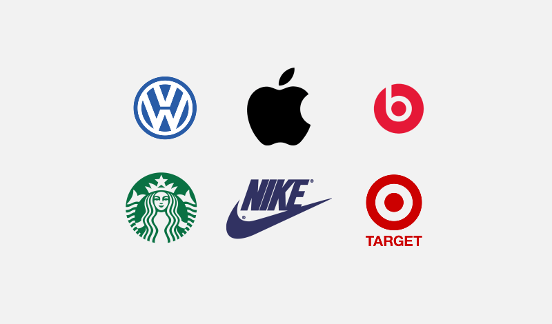
  1. Logo Guidelines: Instructions on how to use your logo, including size, placement, spacing, and acceptable color variations. It also specifies what not to do with the logo to prevent misuse.
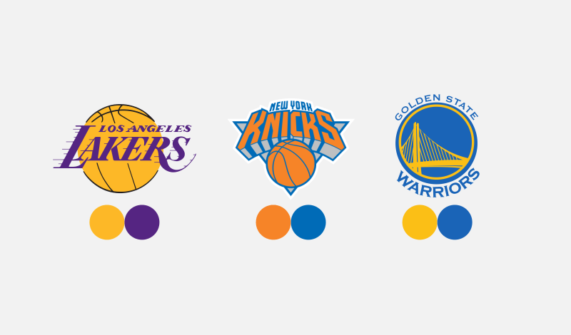
  2. Color Palette: A detailed breakdown of your brand’s colors, including their HEX, RGB, and CMYK codes, so they can be accurately reproduced across all platforms and materials.
  3. Typography: The fonts and typefaces that represent your brand, along with guidelines for their use in headlines, body text, and other elements.
  4. Application Examples: Real-world examples of your brand elements in use, such as business cards, social media graphics, packaging, or advertisements.

Sample Style Guide

Here’s a sample brand style guide that you can view: brand-style-guide.pdf

Why is a Brand Style Guide Important?

A brand style guide is essential for any business that wants to present a cohesive and professional image. Here are some key reasons why it matters:

  • Consistency: Whether you’re posting on social media, creating a website, or printing business cards, a style guide ensures your brand looks and feels the same everywhere.
  • Efficiency: A style guide saves time by providing clear instructions for designers, writers, and marketers, eliminating guesswork and reducing revisions.
  • Brand Recognition: Consistent branding helps your audience recognize and remember your business, making it easier to build a loyal customer base.
  • Professionalism: A cohesive brand presentation communicates that your business is organized, trustworthy, and reliable.

Good Optics Design Co: More Than Just Logos

At Good Optics Design Co, we know that a logo is just one piece of the branding puzzle. While a logo sets the foundation for your brand’s identity, a brand style guide ensures that identity is carried out consistently across every touchpoint.

That’s why we offer brand style guide creation as an add-on service for all our logo design clients. Whether you’re starting a new business or refreshing your existing brand, our team can craft a personalized style guide tailored to your unique needs.

When you work with us, you’ll get more than just a stunning logo. You’ll receive a comprehensive roadmap that empowers you and your team to maintain a cohesive and professional brand presence, no matter where your business takes you.

Ready to Elevate Your Brand?

Your brand deserves more than a logo. Let’s work together to create a brand style guide that sets your business up for success.

Learn more about our services and take the first step toward a stronger, more cohesive brand identity. Your audience is waiting—let’s make a lasting impression.

Design brief
What Is A Logo Design Brief And Why Does It Matter?
What Is A Logo Design Brief And Why Does It Matter? 1024 576 Good Optics Logo & Branding Design

If you’re in the process of getting a logo designed for your business, you may have come across the term “design brief.” But what exactly is it? And why is it such a big deal? Let’s break it down in simple terms.

A design brief is basically a document or questionnaire that helps a designer understand what you’re looking for. Think of it as a roadmap that guides the designer from Point A (your ideas) to Point B (a logo you love).

It’s all about relaying important details about your business, your style preferences, and your goals so the designer can create something that truly represents you. Without a design brief, designing can feel like trying to solve a puzzle without all the pieces.

But here’s the good news: at Good Optics Design Co, we’ve made the process easier than ever. We don’t use a formal design brief—instead, we have a built-in questionnaire right on our sign-up page that gathers all the important details we need.

More on that later, but first, let’s dive into what kind of information is typically included in a design brief and why it matters.


What Kind of Questions Are in a Design Brief?

A well-thought-out design brief asks questions that help uncover your vision, goals, and style. Here are some of the most common questions you’ll see in a design brief and why they’re so important:

1. What does your business do?

This is the foundation of any design project. Knowing what your business does helps the designer craft a logo that’s relevant and effective. For example, a logo for a tech startup will look very different from one for a bakery.

2. Who is your target audience?

Understanding who you’re trying to reach helps the designer create a logo that resonates with the right people. A logo aimed at young, trendy shoppers might look bold and modern, while one for retirees might be more traditional and subdued.

3. What style do you like?

Designers often ask if you have any preferences for colors, fonts, or overall style. Sharing examples of logos you love (or hate) can be a huge help. This ensures the final design aligns with your tastes and expectations.

4. What message do you want your logo to convey?

Your logo isn’t just a pretty picture; it’s a visual representation of your brand. Do you want it to feel playful? Professional? Luxurious? This is your chance to share the vibe you’re going for.

5. Do you have any specific ideas or must-haves?

Maybe you want your logo to include a certain symbol or color that’s meaningful to your brand. Or maybe you’re open to anything! Either way, it’s helpful for the designer to know upfront.


How Good Optics Design Co Keeps It Simple

At Good Optics Design Co, we know that filling out a formal design brief can feel intimidating. That’s why we’ve streamlined the process with an easy-to-use questionnaire right on our sign-up page. It’s built into the process, so you don’t have to worry about downloading documents or sending emails back and forth.

Our questionnaire asks all the essential questions to help us understand your business and your vision. Whether it’s your preferred color palette, your target audience, or the kind of emotions you want your logo to evoke, we cover all the bases. This makes the process not only more efficient but also more pleasant and stress-free for you.


Why Details Matter

Here’s the thing: the more information you give us, the better job we can do. Don’t worry about overwhelming us with details—we love it! The more we know about your business, your preferences, and your goals, the more likely we are to create a logo that’s spot-on.

If you’re not sure what to include, don’t sweat it. Our questionnaire is designed to guide you through the process step by step. Plus, if we have any questions or need clarification, we’ll reach out to make sure we’re on the same page.


Let’s Get Started

A design brief (or in our case, a questionnaire) isn’t just paperwork—it’s a critical tool for creating a logo that you’ll be proud to show off. At Good Optics Design Co, we’ve made the process as simple and streamlined as possible, so you can focus on what matters: bringing your brand to life.

Ready to get started? Head over to our sign-up page, fill out the questionnaire, and let’s create something amazing together!

Logo files for clients
Logo File Formats For Clients
Logo File Formats For Clients 1024 576 Good Optics Logo & Branding Design

When you’ve invested in a professionally designed logo, it’s important to know what you’re getting. At Good Optics Design Co., we ensure you’re equipped with all the variations and file types you’ll need to use your logo across different mediums.

This article breaks down the various logo file formats and variations we provide to our clients in a straightforward and approachable way. Regardless of your knowledge of design, you’ll have a clear understanding of what’s included in your package.

Logo Variations

Every logo project includes multiple variations to ensure your brand’s visual identity works seamlessly across various platforms and contexts. Here are the main types of logo variations you’ll receive:

Logo file formats
The three variations of the typical logo.

Full Lockup

The full lockup is your complete logo, including the iconic mark and the name of your brand. This version is ideal for situations where you want your full branding on display, like your website, business cards, or marketing materials. It’s the cornerstone of your logo package, serving as the most versatile and comprehensive version of your design.

Iconic Mark

This is the standalone icon or symbol from your logo. Think of the Nike swoosh or Apple’s apple—these iconic marks can stand alone and still communicate the brand.

This version is perfect for social media profile pictures, app icons, or situations where a more compact version of your logo is needed.

Wordmark

The wordmark consists solely of your brand’s name in the custom typography or style designed for your logo. This variation is great for signage, headers, or anywhere the name of your business needs to stand alone without the icon.

Color Variations

Color matters. That’s why we prepare your logo in several color variations to ensure it looks great no matter where it’s used. Here are the variations you’ll receive:

Logo color variations
The color variations you’ll receive for your logo.

Full Color On White Backgrounds

This is your logo in its original, vibrant colors meant for use on lighter backgrounds. It’s the default version you’ll use for most of your applications, such as your website, printed materials, and digital graphics.

Full Color On Dark Backgrounds

We also prepare a version of your logo specifically optimized for darker backgrounds. This ensures your brand colors and details remain visible and impactful when placed over dark images, backgrounds, or materials.

Monotone Black

The black monotone version of your logo strips away the colors and focuses on a solid black design. This variation is highly versatile and can be used for applications like embossing, engraving, or black-and-white print materials. It’s clean, classic, and practical.

Monotone White

The white monotone version is similar to the black monotone but designed for dark or colored backgrounds. This version is especially useful for overlays on photos, social media posts, or merchandise like T-shirts and hats.

Logo File Formats

To ensure your logo is ready for anything, we provide it in a variety of file formats. Each serves a specific purpose, so you’ll always have the right tool for the job. They are as follows:

  • SVG
  • EPS
  • PDF
  • AI
  • PNG
  • JPEG

SVG (Scalable Vector Graphic)

SVG files are the holy grail of logo files. They’re vector-based, meaning they can be scaled infinitely without losing quality. Need your logo on a billboard? SVG is your best friend.

It’s also the editable source file, so if you ever need to make changes down the line, this is the file you’ll use.

EPS (Encapsulated PostScript)

An editable file format that works best with video editing and various design applications.

PDF (Portable Document Format)

PDFs are a common and versatile file format. When used for saving/exporting of logos, it retains vector elements and makes for a universal file format that can be edited in any vector design application.

AI (Adobe Illustrator)

Adobe Illustrator is the most commonly-used vector design application. Files saved with the file .AI extension are native Illustrator files, meaning they can be opened and edited in Illustrator without any of the common problems you’d run into when using other file formats cross-platform.

PNG w/ Transparent Background

PNG files are high-quality, pixel-based images that support transparency. This means you can place your logo on any background without worrying about an unsightly white box around it. PNGs are perfect for web use, presentations, and digital overlays.

JPEG

JPEGs are another pixel-based file format, commonly used for photos and digital graphics. They’re great for situations where file size matters, as JPEGs are typically smaller than PNGs.

Use these for emails, websites, and applications where a transparent background isn’t necessary.

Additional File Formats

Upon request, we can also provide additional file formats, such as:

  • PSD: Native Photoshop file editable layers
  • AFDESIGN: Native Affinity Designer file in vector format
  • AFPHOTO: Native Affinity Photo file with editable layers
  • XCF: Native GIMP file with editable layers
  • CDR: Native CorelDraw file in vector format
  • + More! (just ask)

What If I Need A Specific File Type?

We’ve got you covered! If you need a file format or preparation method not mentioned here, just let us know.

At Good Optics Design Co., we’re happy to accommodate your specific needs. Whether it’s a PDF for a print shop or an EPS for embroidery, we’ll provide what you need to make your logo work for you.

Conclusion

Your logo is a vital part of your brand’s identity, and having the right variations and file formats ensures you’re ready for any situation. At Good Optics Design Co., we take pride in delivering a comprehensive package that sets you up for success.

Ready to take your branding to the next level? Contact us today to start your logo design journey!

Logo font usage guide
Font Usage Guidelines When Designing Logos
Font Usage Guidelines When Designing Logos 1024 576 Good Optics Logo & Branding Design

When creating a logo, one of the first steps is choosing the right font. Fonts have the power to convey personality, professionalism, and creativity, but did you know that using fonts in logo designs comes with legal considerations?

Many people overlook the legalities of logo font usage, but they’re important to understand if you want to avoid potential copyright issues. Let’s dive into the rules and best practices for using fonts in logo designs.

Differences Between Free Fonts & Premium Fonts

Fonts generally fall into two categories: free and premium. Free fonts are exactly what they sound like—fonts you can download without paying a cent. Premium fonts, on the other hand, require you to purchase a license to use them.

While free fonts are great for budget-friendly projects, they often come with limitations, especially when it comes to commercial use. Premium fonts, though they cost money, offer advantages like higher quality and more reliable licensing terms. Understanding the differences between these two types of fonts is crucial when designing a logo.

Free Fonts

Free fonts are widely available online, with sites like Dafont and Google Fonts offering thousands of options. However, just because a font is free to download doesn’t mean it’s free to use in any way you want. Most free fonts are only free for personal use, meaning you can use them for hobbies or school projects but not for commercial purposes like logo design.

When designing a logo, commercial use is a given. If you use a free font without checking its licensing terms, you could face legal consequences later. This is a common mistake many people make, especially when they’re unaware of the restrictions attached to free fonts.

Free For Commercial Use

If you’re set on using a free font, make sure it’s labeled as “free for commercial use.” Fonts like these can be found on websites such as Font Squirrel or even Dafont, where you can use a filter to display only fonts that meet this criterion. These fonts come with licenses that explicitly allow you to use them in projects meant for business purposes, including logos.

Using fonts that are free for commercial use is a smart way to avoid legal troubles while still keeping costs low. Just double-check the licensing terms before you commit to a font.

Premium Fonts

Premium fonts are fonts you pay for, and they often come with significant advantages.

First, they’re typically higher in quality. Premium fonts are meticulously designed, making them more legible and visually appealing. They’re also easier to work with when trying to find the perfect match for your design.

Another benefit is that premium fonts usually come with clear licensing agreements, which reduces confusion about how they can be used. While purchasing a premium font may seem like an added expense, it’s often worth it for the professional polish it can bring to your branding.

Do I Have To Purchase A License If My Designer Uses A Premium Font For My Logo?

If you hire a designer to create your logo and they use a premium font, you might wonder if you’re required to purchase a license for the font as well. The good news is, you don’t have to.

Here’s why: when a designer creates your logo, they’re delivering a vector design file, not the font file itself. Copyright law protects the font software—the file that you would install on your computer—but not the appearance of the letters in the design.

Essentially, the designer is using the font as a tool to create something new, and you’re purchasing the final product, not the tool.

What If I Want To Use The Premium Font Elsewhere?

Let’s say you love the font your designer used for your logo and want to incorporate it into other branding materials, such as your website or business cards. In this case, you’ll need to purchase a license for the font yourself.

It’s important to know that there are two main types of font licenses: desktop and web.

A desktop license allows you to use the font in design software like Adobe Illustrator to create printed or digital materials. A web license, on the other hand, allows you to embed the font on your website.

Be sure to choose the correct type of license based on how you plan to use the font. If you’re unsure, consult with your designer or read the font’s licensing terms carefully.

Conclusion

Understanding the legalities of font usage in logo design may seem complicated at first, but it’s essential to protect yourself and your business. Whether you’re using free fonts, free-for-commercial-use fonts, or premium fonts, knowing the rules will save you from potential headaches down the line.

If you’re looking for a professional logo that takes all these considerations into account, Good Optics Design Co is here to help. We’ll handle the design and licensing details so you can focus on building your brand. Contact us today to get started on your logo design journey!

Choosing the right colors for your logo
How To Choose Colors For Your Logo
How To Choose Colors For Your Logo 1024 576 Good Optics Logo & Branding Design

Choosing the right colors for your logo can be complicated, but it doesn’t have to be. In this article, we’ll be sharing some tips for selecting colors that are appropriate for your messaging, as well as defining how many colors should be used for your logo.

The Meaning Of Color

Design is art first and foremost, but it can also be a science. The infographic below illustrates some of the feelings associated with different colors and how it plays into branding:

Color infographic

In summary:

Red:

  • Associated with: Lust, Power, Excitement, Love
  • Example: Beats by Dre

Yellow:

  • Associated with: Competence, Happiness
  • Example: McDonald’s

Green:

  • Associated with: Good Taste, Envy
  • Example: Whole Foods

Blue:

  • Associated with: Masculine, Competence, High Quality, Corporate
  • Example: General Electric (GE)

Pink:

  • Associated with: Sophistication, Sincerity, Feminine
  • Example: Barbie

Purple:

  • Associated with: Authority, Sophistication, Power
  • Example: Yahoo!

Brown:

  • Associated with: Ruggedness
  • Example: UPS

Black:

  • Associated with: Sophistication, Expensive
  • Example: Nike

White:

  • Associated with: Happiness, Sincerity, Purity
  • Example: Apple

Multiple Colors:

  • Associated with: Diversity, Inclusion
  • Example: Google

That said, it should be noted that these are just guidelines. When it comes to art, it’s perfectly okay to break the rules. This is more or less a suggest for when you’re having trouble deciding on a color.

How Many Colors A Logo Should Have

Now let’s go over how many colors a logo ought to have. This is just as — if not more — important than the colors you choose as it can make or break the versatility of your logo.

As a rule, a logo should have 1-3 colors at most. Let’s break down why.

Single-Color Logos

One of the many characteristics of a good logo is that it’s simple, and use of color has a big impact on that. Using only 1 color for your logo will ensure simplicity.

Some of the world’s most recognized brands use just a single color for their logo. Here’s some examples…

Since-color logos
Examples of single-color logos

2-Color Logos

Using 2 colors also lends itself to simplicity, but there are some very basic guidelines that should be considered when using multiple colors.

When designing a logo with 2 colors, it is recommended to use colors that either oppose each other on the color wheel, or contrast well with each other.

Here’s an example of a color wheel…

Color wheel
Complementary colors are those that oppose each other on the color wheel

Colors close to each other on the color wheel tend to clash, especially when being used at a similar contrast. Choosing opposing colors ensures that they’ll complement each other.

Professional sports teams tend to make good use of the color wheel when establishing their logos and brand colors. Here’s some examples of such…

2-Color Logos
Examples of logos that use two colors

You don’t always have to use colors that oppose each other on the color wheel though. You can use different shades of the same color as long as they’re at different contrasts…

Grizzlies logo
An example of a logo that uses contrasting shades of the same color

Finally, you could also take a single color and pair it with any shade in grayscale. Black, white and gray go well with any color…

Grayscale color pairings
Single colors can also be paired with grayscale shades

3 Colors

If you want to get a little more creative, you can use 3 colors for your logo. You’ll generally want to apply the same rules of using 2 colors as you would with 3 colors…

  • Colors opposite each other on the color wheel
  • Different contrasts of the same color
  • Either of the above paired with a shade from the grayscale

Here’s some examples of 3 colors being used effectively in a logo…

3-Color Logos
Examples of logos that use three colors

The Oklahoma City Thunder logo uses two contrasting shades of blue paired with orange, which opposes blue on the color wheel.

The Orlando Magic logo uses two contrasting shades of blue paired with a grayscale shade.

Another approach you can take when using 3 colors for your logo is to pick 3 shades that oppose each other on the color wheel in a triangular shape. Here’s an example of such…

Three Color Logo
An example of how to use three colors based on triangular selection

Notice how blue, yellow, and red oppose each other in a triangular shape. Although the shade of yellow is being used at a very low saturation, it’s within the yellow category, so the same guidelines apply.

The Exceptions

I generally don’t recommend using more than 3 colors for a logo, but there’s always exceptions to the rules, and I don’t like placing limitations on creativity. Here’s some examples of famous brands that use 4 or more colors for their logo…

Multi-color logos
Examples of logos that break the “rules” in using multiple colors

Using multiple colors, from a psychological standpoint, tends to communicate diversity. You can read more about the link between colors and psychology here.

The Importance of Versatility

If there’s one thing I’d like to underscore in this post more than anything else, it’s that making sure your logo works with or without color is far more important than how many colors a logo should have.

Since a logo can be used in a wide range of contexts, it’s important to make sure it’s versatile. It needs to be legible when printed on an all white window decal, or embroidered onto a shirt, for example.

Logo that relies on color
An example of a logo that relies on its color.

A logo that depends on its colors is lacking in versatility. This is why I always design my logos in black and white first, then add color later.

Considerations

Let’s wrap this up by stating that all of the guidelines discussed in this post are just suggestions; not steadfast rules. You won’t have to look very far to find examples of logo designs that break the rules remarkably well. These guidelines are solid and will always steer you in the right direction, but don’t let adherence to them stifle your creativity when determining how many colors a logo should have!

What Are Vector Graphics And Why Are They Used For Logos?
What Are Vector Graphics And Why Are They Used For Logos? 1024 576 Good Optics Logo & Branding Design

Logos are the face of a brand, and designing a logo isn’t just about making something that looks good. It’s about creating something versatile, scalable, and timeless. That’s where vector graphics come in. They’re the secret ingredient behind most professional logo designs. But what exactly are vector graphics, and why are they so essential for logos? Let’s dive in.

Different Types Of Graphics

When it comes to digital images, not all graphics are created equal. There are two main types: raster (or pixel-based) graphics and vector graphics. Each has its strengths and weaknesses, but only one reigns supreme for logo design.

1. Raster or Pixel-Based Graphics

Raster graphics are made up of tiny squares of color called pixels. Think of a digital photo — every dot contributes to the image you see. Common raster formats include JPEG, PNG, and BMP. These graphics are great for detailed images like photos or intricate web graphics, but they have a major downside: scalability.

Zoomed in pixels
Pixel-based images lose quality when enlarged.

When you enlarge a raster image, you’re essentially stretching the pixels, which can result in blurry or pixelated visuals. That’s why raster graphics aren’t ideal for logos. A good logo needs to look sharp whether it’s on a business card or a billboard, and raster images can’t handle that kind of flexibility.

2. Vector Graphics

Unlike raster graphics, vector graphics are built using mathematical equations to define shapes, lines, and curves. This means they’re resolution-independent, allowing them to be scaled up or down without losing quality. Common vector formats include SVG, EPS, and AI.

Vector curve
Vectors are drawn with paths and anchor points/nodes.

Vector graphics shine in logo design because they’re:

  • Scalable: Perfect for use on everything from tiny social media icons to massive banners.
  • Editable: You or your designer can easily tweak the colors, shapes, and text later.
  • Crisp and clean: No matter the size, vector graphics maintain their sharpness.

Having your logo in a vector format ensures it’s future-proof. Whether you’re rebranding or need to make minor adjustments, the editable nature of vector graphics makes life much easier.

Benefits Of Vector Graphics

Here are some of the standout benefits of vector graphics:

  • Infinite scalability with no loss of quality.
  • Easy to edit and customize.
  • Lightweight file sizes compared to high-resolution raster images.
  • Better for printing because they produce sharp, clean lines.
  • Universally supported by professional design software.

Vector File Formats

Here are the most common vector file formats you’ll encounter:

  • SVG (Scalable Vector Graphics): The most universal format, compatible with nearly all vector applications.
  • EPS (Encapsulated PostScript): A versatile format often used for print and professional design work.
  • AI (Adobe Illustrator): Native to Illustrator; great for advanced editing but limited to Adobe software.
  • AFDESIGN (Affinity Designer): Specific to Affinity Designer, offering advanced features without subscription costs.
  • CDR (CorelDraw): Used primarily by CorelDraw software, favored by some professional designers.

Vector Design Software

To edit or create vector graphics, you’ll need specialized software. Here are some popular options:

Illustrator

Adobe Illustrator is the gold standard for vector design. It offers unparalleled tools and features for professionals. However, it comes with a hefty price tag, requiring a monthly subscription. Additionally, it demands robust hardware to run smoothly, making it less accessible for casual users.

Inkscape

If you’re looking for a free alternative, Inkscape is a fantastic choice. It’s open-source and offers many of the same capabilities as Illustrator. The downside? It can be a bit buggy, with occasional crashes. Save your work frequently!

Affinity Designer

Affinity Designer strikes a balance between affordability and functionality. It’s a one-time purchase, offers advanced tools, and is more stable than Inkscape. For those not wanting to commit to Adobe’s subscription model, this is a top pick.

CorelDraw

CorelDraw is another professional-grade vector tool, widely used in industries like engraving and screen printing. While it’s powerful, it’s not as commonly used as Illustrator, which can lead to compatibility issues with other designers.

Common Questions

Let’s address a few questions people often have about vector graphics:

Can I edit my logo myself if I’m a beginner?

Yes, but keep your expectations realistic. Vector software has a learning curve, so you might only feel comfortable making minor edits, like changing colors, resizing elements, or adjusting text. For anything more complex, it’s best to work with a professional.

Can a pixel-based image be converted to vectors?

Technically, no. Think of it like unscrambling an egg. To create a vector version of a raster image, you’d need to trace it manually or use an automated vector tracing tool. Automated tools can work in a pinch but often produce imperfect results, such as jagged edges or speckling.

What are the downsides of using vector graphics?

While vector graphics have many advantages, they’re not without drawbacks:

  • Steeper learning curve: Vector design software can be intimidating for beginners.
  • Limited realism: Vectors aren’t ideal for photo-realistic images.
  • Software requirements: You need vector-specific software to create and edit files.

In Conclusion

Vector graphics are the backbone of professional logo design. They offer unmatched scalability, crispness, and flexibility. Whether you already have vector files or need your artwork vectored, Good Optics Design Co has you covered. We’ll provide you with high-quality vector files in any format you need, ensuring your logo is ready for anything.

Ready to elevate your brand? Hire us today!

What makes a great logo
What Makes A Great Logo?
What Makes A Great Logo? 1024 576 Good Optics Logo & Branding Design

Let’s face it: logos are everywhere. They’re on your coffee cup, your sneakers, and even the pen you accidentally stole from the bank. But what separates a great logo from the mediocre ones? It’s not just about looking pretty or trendy. A great logo is like a good friend: reliable, versatile, and unmistakably unique.

If you’ve ever wondered what makes a logo truly shine, buckle up. We’re diving into the six must-have ingredients for creating a great logo—sprinkled with a dash of humor and a pinch of common sense.


What A Logo Isn’t

Before we get into what makes a great logo, let’s clear up some misconceptions. A logo isn’t a sales pitch, an illustrated storybook, or a Picasso painting. It’s not supposed to sell your product, explain your life story, or dazzle with its complexity.

Nike Swoosh
The Nike Swoosh

Take the Nike Swoosh, for instance. Does it scream, “Buy these shoes because they’ll make you run faster”? Nope. It’s just a simple checkmark-like design that’s become synonymous with athleticism and quality.

The Apple Logo
The Apple Logo

Or consider the Apple logo. It’s literally just an apple with a bite taken out of it. It doesn’t explain how their gadgets work, but it’s become one of the most recognizable symbols in the world.

In short, a logo is just a unique identifier. It’s the face of a brand—clean, simple, and memorable. Let’s keep it that way.


The 6 Ingredients Of A Great Logo

Now that we know what a logo isn’t, let’s get into what it is.

A great logo boils down to six key ingredients. Think of it like baking a cake. Skip one of these, and you’ll end up with a flat, uninspiring mess. But get them all right, and you’ve got a masterpiece.

1. Depiction

Every logo needs to depict something—an idea, a concept, or a vibe. But here’s the kicker: simplicity wins. Trying to cram too many ideas into a single logo is problematic because they clash and fight for attention. Not only is it messy, but it’s also not a good look.

Instead, focus on one or two key ideas.

Twitter Logo
Twitter logo (now “X”)

For instance, the old Twitter logo is just a bird. Simple, right? But it perfectly captures the idea of tweeting, communication, and freedom.

Keep it straightforward, and your logo will be easier to remember.

2. Uniqueness

Nobody wants a logo that screams, “I bought this off a generic template site.” A great logo needs to stand out from the crowd. Uniqueness doesn’t mean reinventing the wheel; it just means adding a personal touch that sets it apart.

Cliche globe logos
Cliche globe logos

Avoid overused cliches like globes for tech companies or lightbulbs for ideas. Instead, think about what makes your brand different. Is there a quirky aspect you can highlight? Uniqueness gives your logo character and helps it stick in people’s minds.

3. Versatility

Logos have to work in the real world, not just on a computer screen. They need to look good on everything from a business card to a billboard. This is where versatility comes in.

A great logo should work in black and white, be scalable to any size, and be simple enough that you could draw it in the sand with a stick.

McDonald's logo
The iconic McDonald’s golden arches

For example, think of the iconic McDonald’s arches. They’re just two golden curves, but they’re instantly recognizable whether they’re 10 feet tall or printed on a napkin.

4. Abstraction

Literal logos are boring. Great logos tend to lean toward abstraction. They hint at an idea rather than shouting it from the rooftops. Subtlety is the name of the game.

Under Armour logo
The Under Armour logo is a U and an A

Take the Under Armour logo. It’s a clever blend of a U and an A, but it’s abstract enough to be interpreted as a symbol of strength and performance.

FedEx logo
Can you see the hidden arrow between the E and the X?

Or consider the FedEx logo, which hides an arrow between the E and the X. It’s a subtle nod to delivery, and it’s brilliant.

5. Typography

If your logo includes text, the typeface matters—a lot. The font should match the mood of your brand and complement any accompanying graphics.

For example, if you’re designing a logo for a high-end fashion brand, a sleek, serif font might do the trick. For a playful kids’ brand, something round and bubbly might work better.

Remember: consistency is key. The typeface’s line thickness and style should harmonize with the rest of the logo.

6. Use Of Color

Color is like the icing on the cake. A great logo uses one or two primary colors, and rarely more than three.

Color wheel
When choosing color combinations, choose colors that oppose each other on the color wheel

Complementary colors—those opposite each other on the color wheel—are often the best choice.

2-Color logos
Complementary color combination examples

Sports teams are masters of this. Think of the LA Lakers’ purple and gold or the New York Kicks’ orange and blue. These combos create a striking visual impact.

Reminder: a good logo shouldn’t rely solely on color. If it falls apart in black and white, it’s back to the drawing board.


When To Break The “Rules”

Rules are made to be broken—even in design. While these six ingredients will give you a rock-solid foundation, don’t be afraid to bend or break them if it serves your creative vision.

Design can be a science, but it’s an art first and foremost. Sometimes, the most memorable logos defy convention. Just remember: breaking the rules is an advanced move. Master the basics first, then start coloring outside the lines.


In Conclusion

Crafting a great logo is both an art and a science. By sticking to the six key ingredients—depiction, uniqueness, versatility, abstraction, typography, and color—you’ll be well on your way to creating something memorable. But don’t forget to add a pinch of your own creativity and flair.

And hey, if all of this feels overwhelming, don’t sweat it. That’s what we’re here for at Good Optics Design Co. Let us help you design a logo that’s not just great but unforgettable.

Ready to get started? Let’s make something amazing together.

  • 1
  • 2