How To Choose Colors For Your Logo
How To Choose Colors For Your Logo https://goodoptics.design/wp-content/uploads/2025/01/logo-colors-1024x576.png 1024 576 Good Optics Logo & Branding Design https://goodoptics.design/wp-content/uploads/2025/01/logo-colors-1024x576.pngChoosing the right colors for your logo can be complicated, but it doesn’t have to be. In this article, we’ll be sharing some tips for selecting colors that are appropriate for your messaging, as well as defining how many colors should be used for your logo.
The Meaning Of Color
Design is art first and foremost, but it can also be a science. The infographic below illustrates some of the feelings associated with different colors and how it plays into branding:
In summary:
Red:
- Associated with: Lust, Power, Excitement, Love
- Example: Beats by Dre
Yellow:
- Associated with: Competence, Happiness
- Example: McDonald’s
Green:
- Associated with: Good Taste, Envy
- Example: Whole Foods
Blue:
- Associated with: Masculine, Competence, High Quality, Corporate
- Example: General Electric (GE)
Pink:
- Associated with: Sophistication, Sincerity, Feminine
- Example: Barbie
Purple:
- Associated with: Authority, Sophistication, Power
- Example: Yahoo!
Brown:
- Associated with: Ruggedness
- Example: UPS
Black:
- Associated with: Sophistication, Expensive
- Example: Nike
White:
- Associated with: Happiness, Sincerity, Purity
- Example: Apple
Multiple Colors:
- Associated with: Diversity, Inclusion
- Example: Google
That said, it should be noted that these are just guidelines. When it comes to art, it’s perfectly okay to break the rules. This is more or less a suggest for when you’re having trouble deciding on a color.
How Many Colors A Logo Should Have
Now let’s go over how many colors a logo ought to have. This is just as — if not more — important than the colors you choose as it can make or break the versatility of your logo.
As a rule, a logo should have 1-3 colors at most. Let’s break down why.
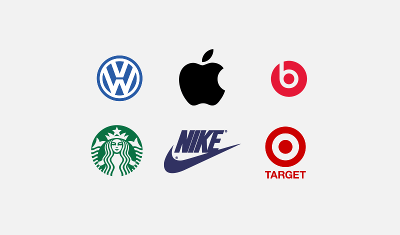
Single-Color Logos
One of the many characteristics of a good logo is that it’s simple, and use of color has a big impact on that. Using only 1 color for your logo will ensure simplicity.
Some of the world’s most recognized brands use just a single color for their logo. Here’s some examples…
2-Color Logos
Using 2 colors also lends itself to simplicity, but there are some very basic guidelines that should be considered when using multiple colors.
When designing a logo with 2 colors, it is recommended to use colors that either oppose each other on the color wheel, or contrast well with each other.
Here’s an example of a color wheel…
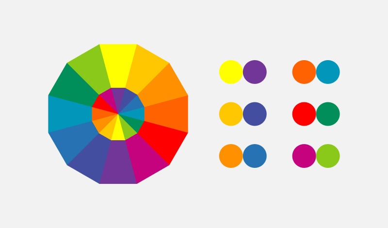
Colors close to each other on the color wheel tend to clash, especially when being used at a similar contrast. Choosing opposing colors ensures that they’ll complement each other.
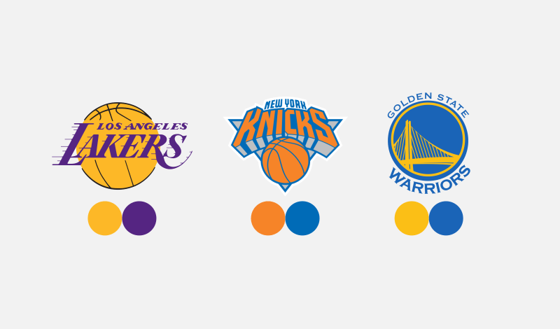
Professional sports teams tend to make good use of the color wheel when establishing their logos and brand colors. Here’s some examples of such…
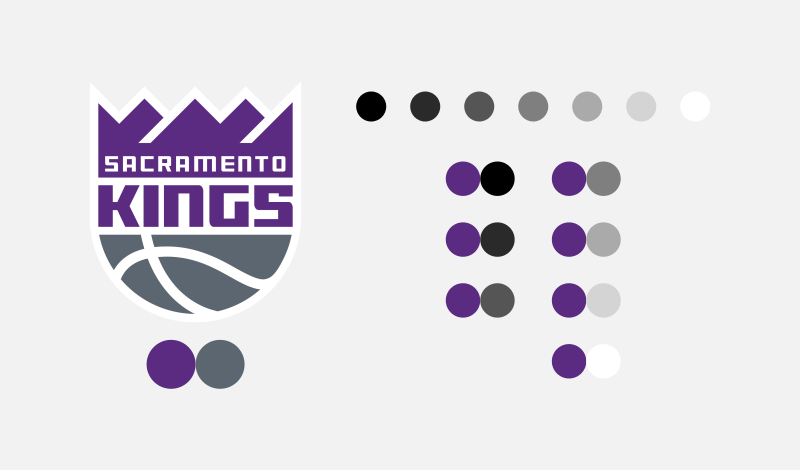
You don’t always have to use colors that oppose each other on the color wheel though. You can use different shades of the same color as long as they’re at different contrasts…
Finally, you could also take a single color and pair it with any shade in grayscale. Black, white and gray go well with any color…
3 Colors
If you want to get a little more creative, you can use 3 colors for your logo. You’ll generally want to apply the same rules of using 2 colors as you would with 3 colors…
- Colors opposite each other on the color wheel
- Different contrasts of the same color
- Either of the above paired with a shade from the grayscale
Here’s some examples of 3 colors being used effectively in a logo…
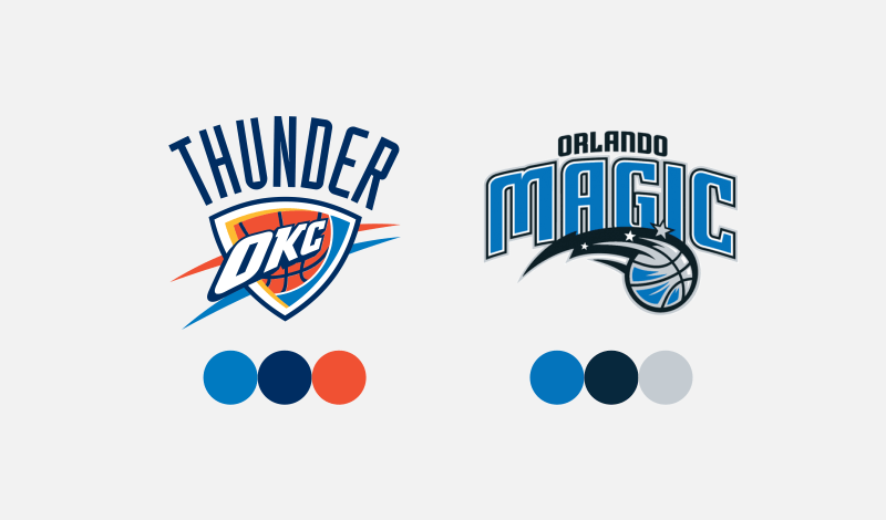
The Oklahoma City Thunder logo uses two contrasting shades of blue paired with orange, which opposes blue on the color wheel.
The Orlando Magic logo uses two contrasting shades of blue paired with a grayscale shade.
Another approach you can take when using 3 colors for your logo is to pick 3 shades that oppose each other on the color wheel in a triangular shape. Here’s an example of such…
Notice how blue, yellow, and red oppose each other in a triangular shape. Although the shade of yellow is being used at a very low saturation, it’s within the yellow category, so the same guidelines apply.
The Exceptions
I generally don’t recommend using more than 3 colors for a logo, but there’s always exceptions to the rules, and I don’t like placing limitations on creativity. Here’s some examples of famous brands that use 4 or more colors for their logo…

Using multiple colors, from a psychological standpoint, tends to communicate diversity. You can read more about the link between colors and psychology here.
The Importance of Versatility
If there’s one thing I’d like to underscore in this post more than anything else, it’s that making sure your logo works with or without color is far more important than how many colors a logo should have.

Since a logo can be used in a wide range of contexts, it’s important to make sure it’s versatile. It needs to be legible when printed on an all white window decal, or embroidered onto a shirt, for example.
A logo that depends on its colors is lacking in versatility. This is why I always design my logos in black and white first, then add color later.
Considerations
Let’s wrap this up by stating that all of the guidelines discussed in this post are just suggestions; not steadfast rules. You won’t have to look very far to find examples of logo designs that break the rules remarkably well. These guidelines are solid and will always steer you in the right direction, but don’t let adherence to them stifle your creativity when determining how many colors a logo should have!