
What Makes A Great Logo?
What Makes A Great Logo? https://goodoptics.design/wp-content/uploads/2025/01/great-logos-1-1024x576.png 1024 576 Good Optics Logo & Branding Design https://goodoptics.design/wp-content/uploads/2025/01/great-logos-1-1024x576.pngLet’s face it: logos are everywhere. They’re on your coffee cup, your sneakers, and even the pen you accidentally stole from the bank. But what separates a great logo from the mediocre ones? It’s not just about looking pretty or trendy. A great logo is like a good friend: reliable, versatile, and unmistakably unique.
If you’ve ever wondered what makes a logo truly shine, buckle up. We’re diving into the six must-have ingredients for creating a great logo—sprinkled with a dash of humor and a pinch of common sense.
What A Logo Isn’t
Before we get into what makes a great logo, let’s clear up some misconceptions. A logo isn’t a sales pitch, an illustrated storybook, or a Picasso painting. It’s not supposed to sell your product, explain your life story, or dazzle with its complexity.
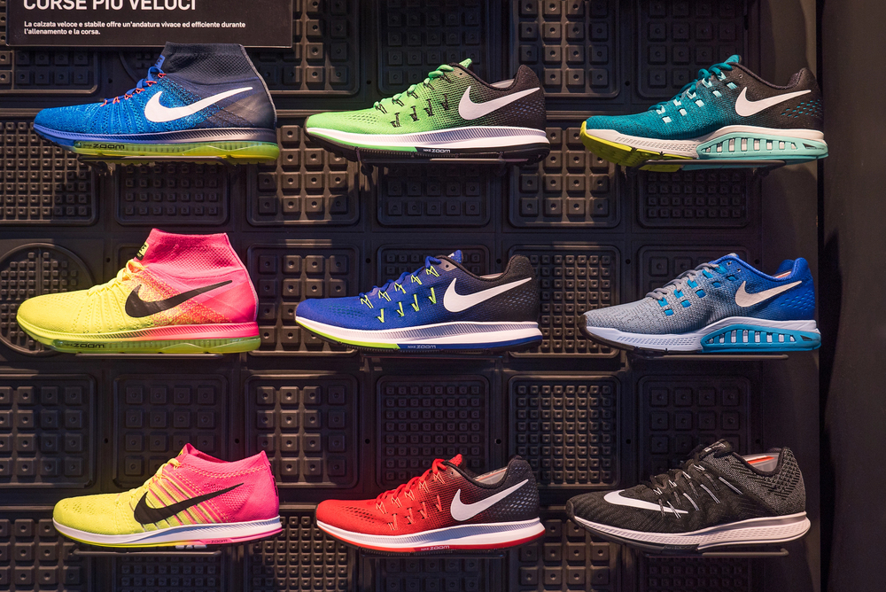
Take the Nike Swoosh, for instance. Does it scream, “Buy these shoes because they’ll make you run faster”? Nope. It’s just a simple checkmark-like design that’s become synonymous with athleticism and quality.
Or consider the Apple logo. It’s literally just an apple with a bite taken out of it. It doesn’t explain how their gadgets work, but it’s become one of the most recognizable symbols in the world.
In short, a logo is just a unique identifier. It’s the face of a brand—clean, simple, and memorable. Let’s keep it that way.
The 6 Ingredients Of A Great Logo
Now that we know what a logo isn’t, let’s get into what it is.
A great logo boils down to six key ingredients. Think of it like baking a cake. Skip one of these, and you’ll end up with a flat, uninspiring mess. But get them all right, and you’ve got a masterpiece.
1. Depiction
Every logo needs to depict something—an idea, a concept, or a vibe. But here’s the kicker: simplicity wins. Trying to cram too many ideas into a single logo is problematic because they clash and fight for attention. Not only is it messy, but it’s also not a good look.
Instead, focus on one or two key ideas.
For instance, the old Twitter logo is just a bird. Simple, right? But it perfectly captures the idea of tweeting, communication, and freedom.
Keep it straightforward, and your logo will be easier to remember.
2. Uniqueness
Nobody wants a logo that screams, “I bought this off a generic template site.” A great logo needs to stand out from the crowd. Uniqueness doesn’t mean reinventing the wheel; it just means adding a personal touch that sets it apart.
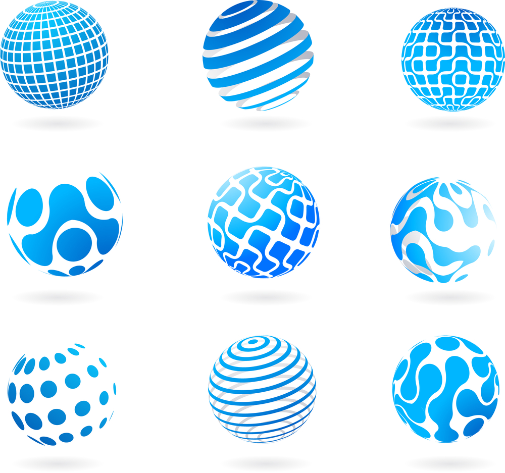
Avoid overused cliches like globes for tech companies or lightbulbs for ideas. Instead, think about what makes your brand different. Is there a quirky aspect you can highlight? Uniqueness gives your logo character and helps it stick in people’s minds.
3. Versatility
Logos have to work in the real world, not just on a computer screen. They need to look good on everything from a business card to a billboard. This is where versatility comes in.
A great logo should work in black and white, be scalable to any size, and be simple enough that you could draw it in the sand with a stick.
For example, think of the iconic McDonald’s arches. They’re just two golden curves, but they’re instantly recognizable whether they’re 10 feet tall or printed on a napkin.
4. Abstraction
Literal logos are boring. Great logos tend to lean toward abstraction. They hint at an idea rather than shouting it from the rooftops. Subtlety is the name of the game.
Take the Under Armour logo. It’s a clever blend of a U and an A, but it’s abstract enough to be interpreted as a symbol of strength and performance.
Or consider the FedEx logo, which hides an arrow between the E and the X. It’s a subtle nod to delivery, and it’s brilliant.
5. Typography
If your logo includes text, the typeface matters—a lot. The font should match the mood of your brand and complement any accompanying graphics.
For example, if you’re designing a logo for a high-end fashion brand, a sleek, serif font might do the trick. For a playful kids’ brand, something round and bubbly might work better.
Remember: consistency is key. The typeface’s line thickness and style should harmonize with the rest of the logo.
6. Use Of Color
Color is like the icing on the cake. A great logo uses one or two primary colors, and rarely more than three.
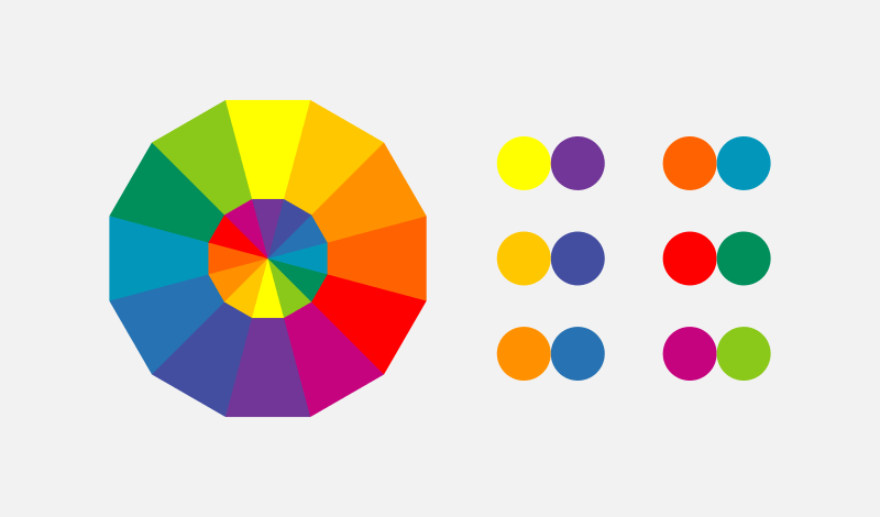
Complementary colors—those opposite each other on the color wheel—are often the best choice.
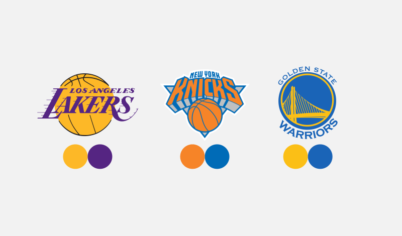
Sports teams are masters of this. Think of the LA Lakers’ purple and gold or the New York Kicks’ orange and blue. These combos create a striking visual impact.
Reminder: a good logo shouldn’t rely solely on color. If it falls apart in black and white, it’s back to the drawing board.
When To Break The “Rules”
Rules are made to be broken—even in design. While these six ingredients will give you a rock-solid foundation, don’t be afraid to bend or break them if it serves your creative vision.
Design can be a science, but it’s an art first and foremost. Sometimes, the most memorable logos defy convention. Just remember: breaking the rules is an advanced move. Master the basics first, then start coloring outside the lines.
In Conclusion
Crafting a great logo is both an art and a science. By sticking to the six key ingredients—depiction, uniqueness, versatility, abstraction, typography, and color—you’ll be well on your way to creating something memorable. But don’t forget to add a pinch of your own creativity and flair.
And hey, if all of this feels overwhelming, don’t sweat it. That’s what we’re here for at Good Optics Design Co. Let us help you design a logo that’s not just great but unforgettable.
Ready to get started? Let’s make something amazing together.