Lettermark Logos: Simplicity Meets Creativity
Lettermark Logos: Simplicity Meets Creativity https://goodoptics.design/wp-content/uploads/2025/01/sticky-site-1024x640.webp 1024 640 Good Optics Logo & Branding Design https://goodoptics.design/wp-content/uploads/2025/01/sticky-site-1024x640.webpLogos are symbols that capture the essence of a company, its values, and its identity. Among the various types of logos, lettermark logos stand out for their simplicity and power. These logos, which are made from initials or letters, can be just as memorable as a more complex design. If you’re considering a lettermark logo for your brand, here’s everything you need to know.
What Are Lettermark Logos?
Lettermark logos are logos that use the initials or first letters of a company name to create a unique and recognizable design.
Lettermarks are a type of monogram logo. Watch our tutorial to learn how to create your own lettermark/monogram logo in Adobe Illustrator:
Instead of using the full name of the company, lettermark logos focus on a few carefully chosen letters, making them simple and easy to remember. These logos are perfect for businesses with long names or those looking for a sleek and modern design.
Let’s take a look at the following examples from our portfolio:
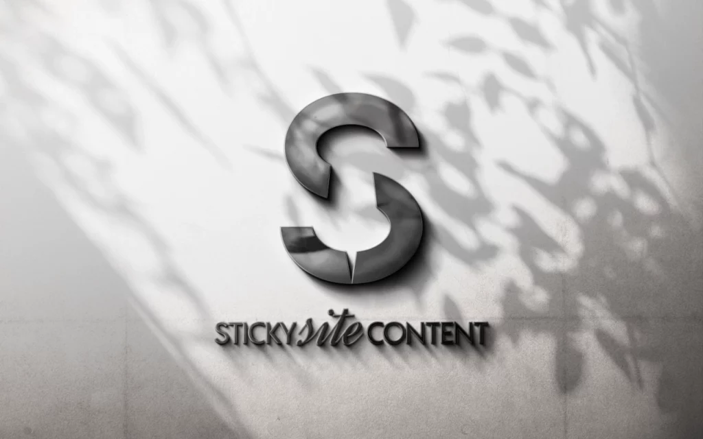
1. StickySite Content

The logo for StickySite Content is a modern take on the letter “S”. By creatively using the negative space into a thumbtack, it turns a simple letter into a relevant and memorable symbol. This design stands out due to its minimalist approach and strong visual impact, perfectly fitting a content-focused brand.
2. T&T Landscaping
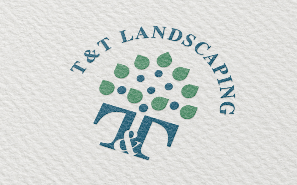
T&T Landscaping’s lettermark logo cleverly incorporates the “T” letters in a way that resembles the form of a tree. The design blends the initial letters with organic shapes, making it clear that this is a landscaping business. The use of green and blue tones adds to the natural, earthy feel of the brand.
3. HC Construction
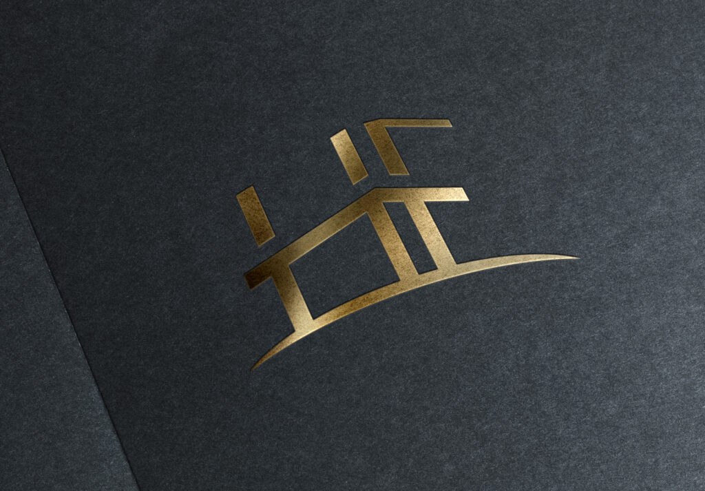
This logo represents a realtor with the initials “H” and “F”, in which it’s stylized into a simple house icon on a hill. It’s a great example of how a lettermark logo can convey creativity and sophistication.
4. Horizon Biomed
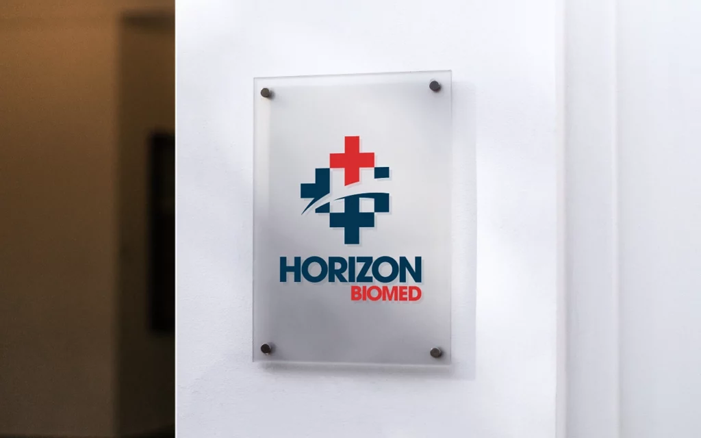
Horizon Biomed’s logo combines the letter “H” with medical symbols, creating a strong and professional lettermark. The integration of the cross and the horizon helps communicate the company’s focus on healthcare and innovation. The bold and clean design ensures that the logo is both professional and instantly recognizable.
5. ChefLife Restaurant Group
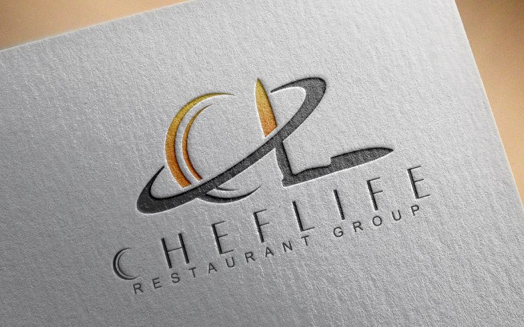
The lettermark logo for ChefLife is sleek and sophisticated. The “C” and “L” are creatively depicted as a plate and knife, giving the logo a dynamic feel. The use of warm, inviting colors like orange and gold hints at the culinary nature of the brand, while the clean font keeps it modern and stylish.
Why Choose a Lettermark Logo?
Lettermark logos are a fantastic choice for several reasons:
- Simplicity: Lettermarks are clean and simple, making them easy to remember.
- Versatility: They work well across different media and are scalable, meaning they look great on everything from business cards to billboards.
- Professional Appeal: A well-designed lettermark logo can convey a sense of sophistication and authority, especially in industries like finance, law, and healthcare.
Ready to Create Your Lettermark Logo?
At Good Optics Design Co, we specialize in creating unique, memorable lettermark logos that are tailored to your brand. Whether you’re starting a new business or rebranding an existing one, we’ll work with you to design a logo that speaks to your audience.
If you’re ready to make a lasting impression, get in touch with us today for all your lettermark design and branding needs.